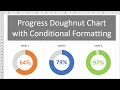
Progress Circle Chart in Excel - Part 1 of 2
The progress circle (doughnut) chart displays the percentage of completion on a single metric. This is a simple chart that can be used in dashboards to show the progress towards a goal or target. It's basically a progress bar chart in the shape of a circle or doughnut.
DOWNLOAD the file: https://www.excelcampus.com/charts/progress-doughnut-chart/
In this first video, we look at how to create the progress doughnut chart in Excel. It is a simple chart that just requires 1 doughnut chart and a formula.
In part 2 of the video series, I explain how to apply conditional formatting to the chart so the color of the bar changes as the progress level changes.
Watch Part 2 - https://youtu.be/dTkV4KmIb1Y
FREE video series on Pivot Table & Dashboards: https://youtu.be/9NUjHBNWe9M
Видео Progress Circle Chart in Excel - Part 1 of 2 канала Excel Campus - Jon
Показать
Комментарии отсутствуют
Информация о видео
Другие видео канала
 Progress Circle Chart with Conditional Formatting - Part 2 of 2
 How To Create A Pie Chart In Excel (With Percentages)
 Progress Bar in Excel Cells using Conditional Formatting
 Rating Meter Chart in Excel || Five Performance Buckets || Show Process or Portfolio Health
 Infographics: Progress Circle Chart in Excel
 How to easily automate boring Excel tasks with Power Query!
 Beginner's Guide to Excel Dashboards
 Pivot Table with Progress Chart and Dashboard
 MIS Report in Excel Progress Chart
 Double Doughnut Chart in Excel
 Create Speedometer Chart In Excel
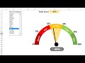 Dynamic Sales Score Meter Chart with Form Control Combo box and List box
 3D Doughnut Chart for KPI Metrics
 How to Create Dashboards in Excel
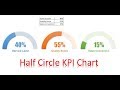 Half Circle KPI info graphic chart
 Excel Doughnut Chart - Conditional Formatting | FREE Download
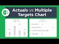 Actual vs Targets Chart in Excel
 Fully Automated Excel dashboard with multiple source files | No VBA used
 Infographics: Filling Circle Chart in Excel
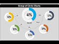 Info-graphics: Group of Circle Charts in Excel