Progress Circle Chart with Conditional Formatting - Part 2 of 2
Sign up for our Excel webinar, times added weekly: https://www.excelcampus.com/blueprint-registration/
The progress circle (doughnut) chart displays the percentage of completion on a single metric. In this second video in the series, we learn how to apply conditional formatting to the chart so the progress bar color changes as the percentage of completion value changes.
DOWNLOAD the file: https://www.excelcampus.com/charts/progress-doughnut-chart/
This will make the chart stand out even more on our dashboards. The reader will be able to quickly see the level of progress and determine if the metric needs attention based on the color of the bar.
The conditional formatting is created using a few IF statement formulas in the source data range for the chart. The IF formulas create the different progress levels. When the actual progress level is within the level range, the cell displays a value and its bar is displayed in the doughnut chart. We use 3 levels in this example, but you can add as many progress levels as you'd like.
In part 1 of the series, we learned how to create the basic Progress Doughnut Chart. Both of these solutions just require 1 Excel doughnut chart and a few formulas. They are pretty easy to set up and implement in your reports and dashboards.
Watch Part 1 - https://youtu.be/KbAmWC2AuSk
Article on the IF Function in Excel: https://www.excelcampus.com/functions/how-to-write-if-function/
FREE video series on Pivot Table & Dashboards: https://youtu.be/9NUjHBNWe9M
Видео Progress Circle Chart with Conditional Formatting - Part 2 of 2 канала Excel Campus - Jon
Показать
Комментарии отсутствуют
Информация о видео
Другие видео канала
 Excel Challenge: Equal Playing Time For Everyone!
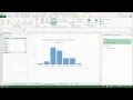 Preview of PowerQuery, Pivot Tables, and Dashboards Video Series
 Excel Vlookup Assistant - Watch A Preview Of How It Works!
 -free Webinar On Excel Dashboards! Quick Tip For Aligning Your Charts In Excel
 Excel 2007 Color Palette Conversion Tutorial
 Best Excel Tutorials For 2022: Top Excel Tips
 Excel Campus Vba Pro Course Tour - Get A Sneak Peek At Our Top-rated Course!
 Quick And Easy Tip For Navigating Formula References With The Go To Window
 The Best Way To Split Text In Excel
 How to Unpivot Data with Power Query in Excel
 Get Your Hero Tools Add-in For Excel Today!
 Excel Mastery Unleashed: The Ultimate Cell Navigation and Selection Shortcuts
 New Excel Keyboard Shortcuts List + PDF Download
 Best Screen Sharing Tips For Virtual Meetings
 How To Use The Screentip Function In Excel To Get More Out Of Your Data!
 Date Functions in Excel - Excel Is My Love Language 💖
 SORT & SORTBY Functions Dashboard Part 4 of 6
 Excel Pro Tips: Mastering the Art of Repeating Your Last Action in Excel
 10 Essential Shortcuts for Excel Tables
 If Vs Vlookup Vs Xlookup - Which One Is Best For Commission?
 7 Essential Habits of VLOOKUP Pros