Easy Lightroom COLOR GRADING from Start to Finish
Here is how to create those warm, orange sunset colors with a bit of #Lightroom post processing
You can follow along this #lightroomtutorial by downloading the raw photo here:
https://drive.google.com/file/d/179ZpVbiK4NPsjY63dOqB_DZNKloRZUw0/view?usp=sharing
▬▬▬▬▬▬▬▬▬▬▬▬▬▬▬▬▬
Thank you for watching my video!
► http://www.the-phlog.com
► Patreon: https://www.patreon.com/phlog
► Instagram: http://www.instagram.com/thephlog
▬▬▬▬▬▬▬▬▬▬▬▬▬▬▬▬▬
0:00 Intro
I wanted to make the original photo a lot warmer with stronger orange color tones throughout the picture while also making the blue tones of the sky a lot darker to create a strong contrast in the top part of the image. All of the pot processing for this photo was done in Lightroom.
0:20 1. Basic Adjustments
I started by changing the profile to Adobe Landscape, then adjusting the white balance temperature to make the base image warmer. I increased the exposure, the highlights and the whites for a brighter picture and for more contrast, I brought down the shadows. To get a sharp shot, I added some texture. Finally, added vibrance and saturation for more intense colors.
2:27 2. Masking
I started by adding glow on the right side. Here, I used a radial gradient and simply increased the blacks, the whites, the temperature and brought down the dehaze. To make the blue sky darker, I used a color range mask and dropped the exposure. I used a linear gradient over the foreground on which I dropped the exposure, while increasing the highlights, texture and clarity. Then, I added another radial gradient over the mountains to introduce some more clarity.
7:14 3. Color Grading
First, in the HSL panel I increased the red hue and dropped the yellow hue. This leads to overall more orange colors in the photo. For the saturation, I slightly pushed orange, while dropping yellow and blue. In the split toning I added a warm and very saturated color to the highlights and a less saturated warm tone to the mid tones. The shadows received a subtle blue color.
Видео Easy Lightroom COLOR GRADING from Start to Finish канала Christian Möhrle - The Phlog Photography
Показать
Комментарии отсутствуют
Информация о видео
20 декабря 2022 г. 21:30:05
00:10:37
Другие видео канала
 Creating a warm Sunrise image with Adobe Photoshop | QE #179
 Colorful Photos with SPLIT TONING Lightroom & Photoshop | QE #188
 Creating Dramatic Weather Photos with Adobe Lightroom Classic | QE #195
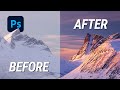 Create MAGIC LIGHT with Photoshop
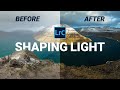 How I Adjust Light for Better Photos in Lightroom
 Removing HAZE & getting back DETAILS with Photoshop | QE #341
 Enhancing Golden Hour Light in Lightroom & Photoshop | QE #276
 Golden Hour Post Processing with Photoshop (with Raw File)
 Dramatic GOLDEN HOUR Light with Photoshop | QE #319
 Photographing in a Hidden Waterfall Cave
 7 SIMPLE Tricks for better CONTRAST in Lightroom
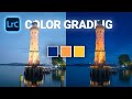 Lovely Blue Hour COLOR GRADING with Lightroom Classic
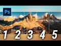 How to create a Dreamy Drone Panorama in Photoshop
 50 Photoshop TIPS, TRICKS & SHORTCUTS for Landscape Photographers
 Vibrant Sunset Color Grading with Photoshop
 How to Create the Vintage Look - Photoshop Tutorial
 Create Abstract Digital Art like Alex Hyner - Photoshop Tutorial
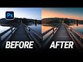 How to create ORANGE SUNSET TONES - Photoshop Tutorial
 Lightroom Basic Adjustments Explained | Lightroom Masterclass EP. 01
 BLINDFOLDED Photo Editing in Lightroom