How to Create the Vintage Look - Photoshop Tutorial
Learn how to easily create beautiful vintage colors for your photos in #Photoshop without the need for presets!
If you want to follow along, feel free to download the raw file here:
https://drive.google.com/file/d/1-6onMPjQ5fh7lV4s5I4HMmTdwZFSj_kp/view?usp=sharing
▬▬▬▬▬▬▬▬▬▬▬▬▬▬▬▬▬
Thank you for watching my video!
► Prints: http://www.the-phlog.com
► Patreon: https://www.patreon.com/phlog
► Instagram: http://www.instagram.com/thephlog
► Facebook: http://www.facebook.com/phlog
▬▬▬▬▬▬▬▬▬▬▬▬▬▬▬▬▬
0:00 Intro
I have worked on this photo before but decided to give it another try. After playing around with a bunch of camera profiles I had the idea of applying a vintage look on it as the base image with the clouds in the sky was a good starting point. 99% of adjustments were done in the camera raw editor here, so this can easily be done in Lightroom as well.
0:28 1. Basic Adjustments
First, I changed the camera profile to “Modern 08”. This is not in the normal profile drop down menu, but in the bigger menu when clicking the browse button. This profile is the perfect base for the vintage look I was aiming for as it nicely adjusted the colors.
To make it look more authentic I increased the exposure to get a very bright, almost overexposed image. I then reduced the contrast, and further increased this effect by raising the shadows and dropping the dehaze. For a little structure I added clarity.
3:50 2. Tone Curve
I skipped the local adjustments and went straight to the tone curve. Here, I set a point in the middle, then raised the point for the blacks to fade them gently and added another point for the highlights to raise them.
4:47 3. Color Grading
First, in the hue tab, I dropped the yellow hue giving the field in the foreground more orange tones. Then, in the saturation menu, I dropped the yellow saturation slightly. Finally, in the Luminance tab I raised the blue luminance to brighten up the sky and the yellow luminance to brighten up the foreground.
For the split toning I added a warm tone to the highlights.
7:35 4. Photoshop
Here, I added the photo filter adjustment layer and lowered the density quite a bit to not make it too strong. Then, I added a vibrance adjustment layer increasing the overall saturation a bit. Finally, with a hue / saturation adjustment layer, I increased the saturation of the cyan tones.
Видео How to Create the Vintage Look - Photoshop Tutorial канала Christian Möhrle - The Phlog Photography
Показать
Комментарии отсутствуют
Информация о видео
5 апреля 2022 г. 20:31:46
00:09:34
Другие видео канала
 Creating a warm Sunrise image with Adobe Photoshop | QE #179
 Colorful Photos with SPLIT TONING Lightroom & Photoshop | QE #188
 Creating Dramatic Weather Photos with Adobe Lightroom Classic | QE #195
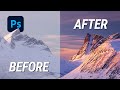 Create MAGIC LIGHT with Photoshop
 How I Adjust Light for Better Photos in Lightroom
 Removing HAZE & getting back DETAILS with Photoshop | QE #341
 Enhancing Golden Hour Light in Lightroom & Photoshop | QE #276
 Golden Hour Post Processing with Photoshop (with Raw File)
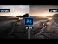 Dramatic GOLDEN HOUR Light with Photoshop | QE #319
 Photographing in a Hidden Waterfall Cave
 7 SIMPLE Tricks for better CONTRAST in Lightroom
 Lovely Blue Hour COLOR GRADING with Lightroom Classic
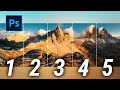 How to create a Dreamy Drone Panorama in Photoshop
 50 Photoshop TIPS, TRICKS & SHORTCUTS for Landscape Photographers
 Easy Lightroom COLOR GRADING from Start to Finish
 Vibrant Sunset Color Grading with Photoshop
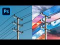 Create Abstract Digital Art like Alex Hyner - Photoshop Tutorial
 How to create ORANGE SUNSET TONES - Photoshop Tutorial
 Lightroom Basic Adjustments Explained | Lightroom Masterclass EP. 01
 BLINDFOLDED Photo Editing in Lightroom