Lovely Blue Hour COLOR GRADING with Lightroom Classic
In this #Adobe #Lightroom Classic #Tutorial I’m showing you the blue hour color grading process in detail.
▬▬▬▬▬▬▬▬▬▬▬▬▬▬▬▬▬
Thank you for watching my video!
► Prints: http://www.the-phlog.com
► Patreon: https://www.patreon.com/phlog
► Instagram: http://www.instagram.com/thephlog
► Facebook: http://www.facebook.com/phlog
▬▬▬▬▬▬▬▬▬▬▬▬▬▬▬▬▬
0:00 Intro
Blue hour photography is a very cool photography niche. This kind of photography works really well with beautiful architecture in the foreground which gets hit by artificial lights because of the color contrast between the yellow tones of the lights and the blue tones of the sky. However, your raw photos might look strange out of camera, so this video is here to help you color grad your blue hour pictures.
For this photo, I wanted to make the blue sky in the background a lot darker while the lighthouse in the foreground keeps it brightness. For both color tones I wanted to push the saturation and thus get this nice contrast between the blue background the yellow light house. Everything here (except for the removal of objects) was done in Adobe Lightroom Classic, so the editing should be very easy.
0:39 1. Basic Adjustments
I started by changing the camera profile to Adobe Standard which gives me a little more control over the contrast and the colors. Since the white balance of the original raw was good already, I didn’t adjust that. To continue, I dropped the exposure slightly as well as the highlights. Then, I raised the shadows and the whites. For extra sharpness I added texture. Finally, I added vibrance to bring back some saturation to the blue hour photo.
2:45 2. Local Adjustments
Now it’s time to darken the sky. Here I used a graduated filter over the sky. Of course this will also affect the lighthouse in the center (which I don’t want to darken) so to fix that I used a color range mask and targeted the specific blue tones of the background I wanted to change. Once that was set up, I dropped the exposure, the shadows and introduced stronger blue tones by dropping the temperature.
4:35 3. Color Grading
In the HSL panel I dropped the saturation of all the colors except for yellow, orange and blue which I pushed a little bit. For the split toning I added a warm tone to the highlights and a cold tone to the shadows.
Видео Lovely Blue Hour COLOR GRADING with Lightroom Classic канала Christian Möhrle - The Phlog Photography
▬▬▬▬▬▬▬▬▬▬▬▬▬▬▬▬▬
Thank you for watching my video!
► Prints: http://www.the-phlog.com
► Patreon: https://www.patreon.com/phlog
► Instagram: http://www.instagram.com/thephlog
► Facebook: http://www.facebook.com/phlog
▬▬▬▬▬▬▬▬▬▬▬▬▬▬▬▬▬
0:00 Intro
Blue hour photography is a very cool photography niche. This kind of photography works really well with beautiful architecture in the foreground which gets hit by artificial lights because of the color contrast between the yellow tones of the lights and the blue tones of the sky. However, your raw photos might look strange out of camera, so this video is here to help you color grad your blue hour pictures.
For this photo, I wanted to make the blue sky in the background a lot darker while the lighthouse in the foreground keeps it brightness. For both color tones I wanted to push the saturation and thus get this nice contrast between the blue background the yellow light house. Everything here (except for the removal of objects) was done in Adobe Lightroom Classic, so the editing should be very easy.
0:39 1. Basic Adjustments
I started by changing the camera profile to Adobe Standard which gives me a little more control over the contrast and the colors. Since the white balance of the original raw was good already, I didn’t adjust that. To continue, I dropped the exposure slightly as well as the highlights. Then, I raised the shadows and the whites. For extra sharpness I added texture. Finally, I added vibrance to bring back some saturation to the blue hour photo.
2:45 2. Local Adjustments
Now it’s time to darken the sky. Here I used a graduated filter over the sky. Of course this will also affect the lighthouse in the center (which I don’t want to darken) so to fix that I used a color range mask and targeted the specific blue tones of the background I wanted to change. Once that was set up, I dropped the exposure, the shadows and introduced stronger blue tones by dropping the temperature.
4:35 3. Color Grading
In the HSL panel I dropped the saturation of all the colors except for yellow, orange and blue which I pushed a little bit. For the split toning I added a warm tone to the highlights and a cold tone to the shadows.
Видео Lovely Blue Hour COLOR GRADING with Lightroom Classic канала Christian Möhrle - The Phlog Photography
Показать
Комментарии отсутствуют
Информация о видео
20 июля 2021 г. 20:39:21
00:07:59
Другие видео канала
 Creating a warm Sunrise image with Adobe Photoshop | QE #179
 Colorful Photos with SPLIT TONING Lightroom & Photoshop | QE #188
 Creating Dramatic Weather Photos with Adobe Lightroom Classic | QE #195
 Creating a Colorful HDR PANORAMA with Adobe Lightroom Classic | QE #287
 Moody edit with fake Fog in Photoshop | QE #143
 Create MAGIC LIGHT with Photoshop
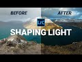 How I Adjust Light for Better Photos in Lightroom
 Create Dramatic Black & White images in Lightroom | QE #169
 Create DRAMATIC Light in Lightroom Classic | QE #284
 REMOVE ANYTHING with Generative AI - BIG Lightroom Classic Update!
 Removing HAZE & getting back DETAILS with Photoshop | QE #341
 Enhancing Golden Hour Light in Lightroom & Photoshop | QE #276
 Gloomy Mountain Landscape with Lightroom & Photoshop | QE #166
 Golden Hour Post Processing with Photoshop (with Raw File)
 Dramatic GOLDEN HOUR Light with Photoshop | QE #319
 Photographing in a Hidden Waterfall Cave
 7 SIMPLE Tricks for better CONTRAST in Lightroom
 Easy Mountain Landscape Editing in Lightroom | QE #108
 Firey Winter Sunrise Lightroom & Photoshop CC Editing | QE #60
 How to create a Dreamy Drone Panorama in Photoshop