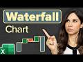
Create Waterfall Chart, Auto update Bar Colour and Data labels, Advanced Tutorial
Learn to create linked / automated Waterfall chart with distinct colours for up and down variances, data labels update automatically, graph colour changes automatically to reflect the positive and negative values, and the chart is updated with changes in the pivot table.
Learn how to analyse sales and profitability of a business through variance analysis at https://www.udemy.com/course/learn-financial-analysis-of-variances-in-profit-and-sales/?couponCode=YOUTUBE10
https://www.instagram.com/learnaccountingfinance
https://www.learnaccountingfinance.com
Learn pivot table data crunching business skills here: https://amzn.to/3lgYB5E
Learn all about Excel in one place: https://amzn.to/3laCXQx
Subscribe: http://www.youtube.com/c/LearnAccountingFinance?sub_confirmation=1
Zero values are also hidden. This is the best method of creating a Waterfall chart in Excel.
Do not spend too much time trying to figure out how to create waterfall chart in Excel. This video shows you a simple yet highly effective method of creating a waterfall chart in Excel.
You will also learn to use the IF function, formatting of data labels to hide zero values, adjusting the scale of Axis on the chart.
A waterfall chart is a form of data visualization that helps in understanding the cumulative effect of sequentially introduced positive or negative values. The waterfall chart is also known as a flying bricks chart or Mario chart due to the apparent suspension of columns (bricks) in mid-air. Build a bridge or waterfall chart in Excel
A waterfall chart can be used for analytical purposes, especially for understanding or explaining the gradual transition in the quantitative value of an entity which is subjected to increment or decrement. Make a waterfall chart in Excel
Create a Waterfall chart in Excel with auto updating data labels
Once you learn the trick, its not difficult at all and can be automated for changing set of values in a data table or pivot table.
Hope you enjoy the video. Make sure to give a thumbs up, and share your thoughts in the comments section
Видео Create Waterfall Chart, Auto update Bar Colour and Data labels, Advanced Tutorial канала Learn Accounting Finance
Показать
Комментарии отсутствуют
Информация о видео
15 августа 2017 г. 10:09:00
00:16:28
Другие видео канала
 Easiest Excel Waterfall Chart (Bridge graph) from Scratch - Works with minus values
 How to build Interactive Excel Dashboards
 3D Container Pivot Chart with Slicers and Timeline
 WEBINAR Creating Waterfall Charts Excel 2010 and 2016
 Thinkcell Training
 This Excel Chart will grab your attention (Infographic template included)
 Pivot Table with Progress Chart and Dashboard
 ☑️ Top 25 Advanced Pivot Table Tips & Tricks For Microsoft Excel
 Waterfall chart (think-cell tutorials)
 Trick Excel into Creating Regular Charts from PivotTables - 3 Easy Techniques
 Dynamic Variance Arrows Chart with Check Boxes
 Why you should use Excel's Cube functions instead of GETPIVOTDATA.
 Create an Excel Waterfall Chart
 Excel Dynamic Chart with Drop down List (column graph with average line)
 Excel Masterclass Waterfall Chart
 Excel Dashboard - Plan vs Actual Variances - FREE Download
 Excel Tricks : How To Create Waterfall Chart In Excel | Excel Graphs | Excel Tips || dptutorials
 Excel 2016 Waterfall Chart - Advantages and Limitations - Ultimate guide to Excel's Bridge Graph
 How to create a waterfall chart in Excel
 Bagaimana Membuat Waterfall Chart