This Excel Chart will grab your attention (Infographic template included)
Learn how to create Excel graphs that are different to the norm but still visually effective. They are great to include in special reports and dashboards.
Download the workbook here: http://bit.ly/2rCXXrE
Complete Excel Dashboard course: https://courses.xelplus.com/p/professional-excel-dashboards
Note: This techniques is a part of my online Dashboard course.
The link to the original report I mention in the video - https://business.udemy.com/blog/learning-predictions-2017/
This video shows you how to create special (non-standard) Excel graphs or info-charts in Excel. Not only that but it also shows you how you can conditionally format your graph to highlight specific categories. In this example, I show you how to highlight the week day that has the most users logged on to a system, but you can apply the same technique to any other logic as well.
After that, I show you how you can add shapes to charts. This attracts the attention of your readers because it's different to what they are used to seeing. The problem with this technique is that it stretches out the shape for the bigger data sets so depending on the shape you are using, they are no longer harmonized.
As a last step, I show you a trick you can use to create harmonized shapes in your Excel graphs. It's all a matter of proper data preparation before you draw out the chart.
★ My Online Excel Courses ► https://www.xelplus.com/courses/
✉ Subscribe & get my TOP 10 Excel formulas e-book for free
https://www.xelplus.com/free-ebook/
EXCEL RESOURCES I Recommend: https://www.xelplus.com/resources/
Get Office 365: https://microsoft.msafflnk.net/15OEg
Microsoft Surface: https://microsoft.msafflnk.net/c/1327040/451518/7593
GEAR
Screen recorder: http://techsmith.pxf.io/c/1252781/347799/5161
Main Camera: https://amzn.to/3a5ldBs
Backup Camera: https://amzn.to/2FLiFho
Main Lens: https://amzn.to/39apgeD
Zoom Lens: https://amzn.to/3bd5pN7
Audio Recorder: https://amzn.to/2Uo5rLm
Microphone: https://amzn.to/2xYy9em
Lights: http://amzn.to/2eJKg1U
More resources on my Amazon page: https://www.amazon.com/shop/leilagharani
Time Stamps
00:00 Why Create a Non-Standard Column Chart in Excel
01:48 Start with Basic Column Chart
02:44 Conditional Formatting of Excel Column Chart for MAX-Value
05:51 Create Round Shape for Excel Column Chart
07:45 Prevent Stretching of Round Shape in Column Chart
10:41 Add Data Labels to Excel Chart
12:45 Add Conditional Formatting to Rounded Column Chart
Let’s connect on social:
Instagram: https://www.instagram.com/lgharani
Twitter: https://twitter.com/leilagharani
LinkedIn: https://at.linkedin.com/in/leilagharani
Note: This description contains affiliate links, which means at no additional cost to you, we will receive a small commission if you make a purchase using the links. This helps support the channel and allows us to continue to make videos like this. Thank you for your support!
#MsExcel
Видео This Excel Chart will grab your attention (Infographic template included) канала Leila Gharani
Показать
Комментарии отсутствуют
Информация о видео
Другие видео канала
 Build Impressive Charts: It's NOT your usual Bar Chart (Infographics in Excel)
 4 SMART Ways to use Custom Formatting instead of Conditional Formatting in Excel - Part 1
 Return Multiple Match Results in Excel (2 methods)
 5 QUICK Ways to Improve Your PowerPoint Design
 Secrets to Building Excel Dashboards in Under 15 Minutes!
 50 Ultimate Excel Tips and Tricks for 2020
 Excel Dashboard - Plan vs Actual Variances - FREE Download
 Excel Pivot Tables EXPLAINED in 10 Minutes (Productivity tips included!)
 When Should you Use the Hash Sign (#) in Excel Formulas?
 Progress Circle Chart in Excel as NEVER seen before!
 6 FREE Add-Ins for Excel to Start Using Now
 Excel Charts: Sorted Bar Chart as Alternative to the Pie Chart
 3 PowerPoint HACKS for INSTANT Improvement (incl. Morph between Shapes)
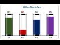 Info-graphics: 3D Glass Chart in Excel
 How to use Excel Index Match (the right way)
 How to easily automate boring Excel tasks with Power Query!
 Info-graphics: Group of Circle Charts in Excel
 When You Should Use the New Excel LET Function
 Pivot Table with Progress Chart and Dashboard
 Excel Charts & Graphs: Learn the Basics for a Quick Start