- Популярные видео
- Авто
- Видео-блоги
- ДТП, аварии
- Для маленьких
- Еда, напитки
- Животные
- Закон и право
- Знаменитости
- Игры
- Искусство
- Комедии
- Красота, мода
- Кулинария, рецепты
- Люди
- Мото
- Музыка
- Мультфильмы
- Наука, технологии
- Новости
- Образование
- Политика
- Праздники
- Приколы
- Природа
- Происшествия
- Путешествия
- Развлечения
- Ржач
- Семья
- Сериалы
- Спорт
- Стиль жизни
- ТВ передачи
- Танцы
- Технологии
- Товары
- Ужасы
- Фильмы
- Шоу-бизнес
- Юмор
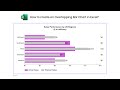
Walking in the Customer’s Shoes: Navigating the customer journey using Sankey Diagram in Power BI
Create the customer journey flow using Sankey Diagram in Microsoft Power BI in a few minutes with a few clicks.
Walking in the Customer’s Shoes: Navigating the customer journey using Sankey Diagram in Microsoft Power BI is a guide that will help you understand your customers better by visualizing their journey through your business. You will learn how to create a Sankey diagram in Power BI and how to use it to identify areas where you can improve your customer experience.
To use a Sankey diagram to improve your customer experience, you will need to identify areas where there are bottlenecks or where customers are dropping off. Once you have identified these areas, you can take steps to improve the customer experience in these areas.
For example, if you see that a lot of customers are dropping off at the checkout stage, you can try to make the checkout process easier or more convenient. You can also try to identify why customers are dropping off and address those issues.
Install ChartExpo Sankey Diagram Microsoft Power BI custom visual
https://chartexpo.com/utmAction/MTYrdXQrcGIrY2V4cG8rNTI5OStTYW5rZXkr
Install ChartExpo Sankey Diagram add-in for Microsoft Excel or Office 365
https://chartexpo.com/utmAction/MTArdXQreGwrcHBjKzUxOTEr
Install ChartExpo Sankey Diagram for Google Sheets
https://chartexpo.com/utmAction/MTArdXQrZ3MrcHBjKzUxOTEr
Explore more charts and visualizations
https://chartexpo.com/tools/power-bi-sankey-diagram?source=YouTube
Video Summary:
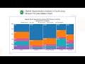
This Customer Journey Sankey diagram in Power BI is a good example to visualize how customers interact with your business at different stages of their journey. You can take steps to improve the customer experience in these areas.
Chapters:
0:00 Data requirements for Sankey Diagram
0:45 How to add ChartExpo add-in for Sankey Diagram in Power BI?
1:10 How to add data source for Sankey Diagram?
1:43 How to bind data model with ChartExpo Sankey Diagram?
3:05 How to enable trial mode?
3:26 How to remove watermark from Sankey Diagram?
3:58 How to customize Sankey Diagram with different set of properties?
#chartexpo #charts #graphs #datavisualization #datastorytelling #dataviz #visualization #DataAnalytics #BusinessIntelligence #powerbi #sankeydiagram #sankeychart
Tags:
Custom charts
Custom visualizations
Advance charts
Professional charts
Data charting
Data visualization tools
Power BI Sankey diagram tutorial
Sankey diagram in Power BI
Power BI Sankey chart visual
Data visualization in Power BI
Power BI
Power BI Tutorials
Power BI custom visuals
What is customer journey mapping?
How to create a customer journey map?
Customer journey mapping tutorial
Customer experience
Visualize the flow of resources
Customers' interactions
Visualize customer journey
Видео Walking in the Customer’s Shoes: Navigating the customer journey using Sankey Diagram in Power BI канала ChartExpo
Walking in the Customer’s Shoes: Navigating the customer journey using Sankey Diagram in Microsoft Power BI is a guide that will help you understand your customers better by visualizing their journey through your business. You will learn how to create a Sankey diagram in Power BI and how to use it to identify areas where you can improve your customer experience.
To use a Sankey diagram to improve your customer experience, you will need to identify areas where there are bottlenecks or where customers are dropping off. Once you have identified these areas, you can take steps to improve the customer experience in these areas.
For example, if you see that a lot of customers are dropping off at the checkout stage, you can try to make the checkout process easier or more convenient. You can also try to identify why customers are dropping off and address those issues.
Install ChartExpo Sankey Diagram Microsoft Power BI custom visual
https://chartexpo.com/utmAction/MTYrdXQrcGIrY2V4cG8rNTI5OStTYW5rZXkr
Install ChartExpo Sankey Diagram add-in for Microsoft Excel or Office 365
https://chartexpo.com/utmAction/MTArdXQreGwrcHBjKzUxOTEr
Install ChartExpo Sankey Diagram for Google Sheets
https://chartexpo.com/utmAction/MTArdXQrZ3MrcHBjKzUxOTEr
Explore more charts and visualizations
https://chartexpo.com/tools/power-bi-sankey-diagram?source=YouTube
Video Summary:
This Customer Journey Sankey diagram in Power BI is a good example to visualize how customers interact with your business at different stages of their journey. You can take steps to improve the customer experience in these areas.
Chapters:
0:00 Data requirements for Sankey Diagram
0:45 How to add ChartExpo add-in for Sankey Diagram in Power BI?
1:10 How to add data source for Sankey Diagram?
1:43 How to bind data model with ChartExpo Sankey Diagram?
3:05 How to enable trial mode?
3:26 How to remove watermark from Sankey Diagram?
3:58 How to customize Sankey Diagram with different set of properties?
#chartexpo #charts #graphs #datavisualization #datastorytelling #dataviz #visualization #DataAnalytics #BusinessIntelligence #powerbi #sankeydiagram #sankeychart
Tags:
Custom charts
Custom visualizations
Advance charts
Professional charts
Data charting
Data visualization tools
Power BI Sankey diagram tutorial
Sankey diagram in Power BI
Power BI Sankey chart visual
Data visualization in Power BI
Power BI
Power BI Tutorials
Power BI custom visuals
What is customer journey mapping?
How to create a customer journey map?
Customer journey mapping tutorial
Customer experience
Visualize the flow of resources
Customers' interactions
Visualize customer journey
Видео Walking in the Customer’s Shoes: Navigating the customer journey using Sankey Diagram in Power BI канала ChartExpo
Data visualizations Data storytelling Charts Graphs Power BI Tutorials Power BI custom visuals Sankey diagram in Power BI Power BI Sankey diagram tutorial What is customer journey mapping? How to create a customer journey map Customer journey mapping tutorial Customer experience Visualize the flow of resources Customers' interactions Visualize customer journey how to improve customer experience how to improve customer service customer pain points user experience
Комментарии отсутствуют
Информация о видео
8 августа 2023 г. 17:42:46
00:08:35
Другие видео канала