Create a Column Chart Showing Percentages
This video show how to add percentage labels to a column chart. A percentage (%) label is not a feature in columns charts like a pie chart, but there are workaround to add those in. This video covers a couples ways to do that (Example 1 (01:06), Example 2 (03:38), Example 3 (07:34). Note that the % shown in the video should have been a summation for the labels across the regions (my bad).
🔔 SUBSCRIBE to my channel ➜ https://goo.gl/wN3c3p
🏫 Excel Training ➜ https://www.exceltraining101.com/p/training.html
📚 Excel Books & Tech Gear ➜ https://www.amazon.com/shop/dough
⚙️ Tools: Screencasting ➜ https://techsmith.z6rjha.net/5Qe53
⚙️ Tools: Microsoft Office ➜ https://microsoft.msafflnk.net/rKL0G
⚙️ Tools: TubeBuddy ➜ https://www.tubebuddy.com/et101
📝 This description may contain affiliate links and we'll receive a small commission if a purchased is made using the links (but at no additional cost to you). It'll support the channel and so more videos like this can be made. Thanks for your support!
🎁 If you find these videos useful and want to support my channel go to https://www.buymeacoffee.com/dough
#excel
#msexcel
#doughexcel
Видео Create a Column Chart Showing Percentages канала Doug H
Показать
Комментарии отсутствуют
Информация о видео
Другие видео канала
 Excel Quick and Simple Charts Tutorial
 Column Chart That Displays Percentage Change in Excel - Part 1
 Create a Combination Chart with a Totals Label
 Excel Charts: How To Show Percentages in Stacked Charts (in addition to values)
 Excel Magic Trick # 267: Percentage Change Formula & Chart
 How to create a Clustered Stacked Column Chart in Excel
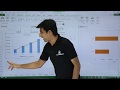 MS Excel - Pie, Bar, Column & Line Chart
 MS Excel - Column Chart
 Quickly convert Numbers to Percentages in Excel
 How To Create A Pie Chart In Excel (With Percentages)
 Introduction to Pivot Tables, Charts, and Dashboards in Excel (Part 1)
 Pivot Table with Progress Chart and Dashboard
 Excel Column Chart - Stacked and Clustered combination graph
 Multiple Bar Graphs in Excel
 Making a Simple Bar Graph in Excel
 How-to Add Percentages Above a Column or Stacked Column Chart in Excel
 MS Excel Charts & Graphs | How To Make A Pie, Bar, Column & Line Chart in Excel Hindi | Part 24
 How to create Bar Chart with percentage in exel
 Excel: Pivot tables and bar chart with error bars