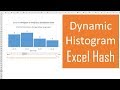
Create A Column Chart That Shows Percentage Change In Excel - Part 1
Learn how to create a column chart that displays the percentage change between each column. This is an Excel chart that uses error bars and some formulas to show the variance between each time period (month, quarter, year, etc.)
Download the Excel file:
https://www.excelcampus.com/charts/column-chart-percentage-change/
-- LINKS --
RELATED LINK ► This chart was inspired by a chart in an article on music industry trends from Visual Capitalist: http://www.visualcapitalist.com/music-industry-sales/
*** JOIN OUR COMPREHENSIVE EXCEL TRAINING PROGRAM***
https://www.excelcampus.com/join-elevate/
~ Learn my BLUEPRINT for Excel including when to use what tool (FREE TRAINING SESSION) https://www.excelcampus.com/blueprint ~
~Become an Excel Campus Insider (100% free) to access advanced workshops, bonus training, and weekly Excel tips: https://www.excelcampus.com/newsletter/
~I've also published another video with a 2nd iteration that includes color bars & data labels (conditional formatting), slicers, and is more dynamic. Here is a link to that video:
Part 2: https://youtu.be/zaYfih4aOGE
Part 3: https://youtu.be/X0ySDc5KwsM
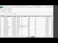
One request we almost always get with our column or bar charts is to see the variance or percentage change between each column. This is especially true when the chart displays a trend over months, quarters, years, etc.
The solution uses a regular clustered column chart in Excel. The second series is made invisible with No Fill on the column, and then uses error bars to display the variance between amount columns.
**Excel 2010 & Earlier**
If you are using Excel 2010 or earlier you will not have the Value from Cells option for the data labels. However, you can use the free XY Labeler add-in from AppsPro to create the labels. This will save you a lot of time. Here is the link to download the add-in.
http://www.appspro.com/Utilities/ChartLabeler.htm
Related articles & videos:
Part 2 with colored error bars & labels: https://youtu.be/zaYfih4aOGE
Variance on Clustered Column for Actual versus Budget: https://www.excelcampus.com/charts/variance-clustered-column-bar-chart/
3-part Video Series on Pivot Tables & Dashboards: https://youtu.be/9NUjHBNWe9M
Free Chart Alignment Add-in: https://www.excelcampus.com/keyboard-shortcuts/chart-alignment-add-in/
00:00 Introduction
01:08 Source Data
02:05 Error Bars
04:38 Subscribe
04:50 Add Data Labels
06:44 Formatting Tips
09:31 Outro
Видео Create A Column Chart That Shows Percentage Change In Excel - Part 1 канала Excel Campus - Jon
Download the Excel file:
https://www.excelcampus.com/charts/column-chart-percentage-change/
-- LINKS --
RELATED LINK ► This chart was inspired by a chart in an article on music industry trends from Visual Capitalist: http://www.visualcapitalist.com/music-industry-sales/
*** JOIN OUR COMPREHENSIVE EXCEL TRAINING PROGRAM***
https://www.excelcampus.com/join-elevate/
~ Learn my BLUEPRINT for Excel including when to use what tool (FREE TRAINING SESSION) https://www.excelcampus.com/blueprint ~
~Become an Excel Campus Insider (100% free) to access advanced workshops, bonus training, and weekly Excel tips: https://www.excelcampus.com/newsletter/
~I've also published another video with a 2nd iteration that includes color bars & data labels (conditional formatting), slicers, and is more dynamic. Here is a link to that video:
Part 2: https://youtu.be/zaYfih4aOGE
Part 3: https://youtu.be/X0ySDc5KwsM
One request we almost always get with our column or bar charts is to see the variance or percentage change between each column. This is especially true when the chart displays a trend over months, quarters, years, etc.
The solution uses a regular clustered column chart in Excel. The second series is made invisible with No Fill on the column, and then uses error bars to display the variance between amount columns.
**Excel 2010 & Earlier**
If you are using Excel 2010 or earlier you will not have the Value from Cells option for the data labels. However, you can use the free XY Labeler add-in from AppsPro to create the labels. This will save you a lot of time. Here is the link to download the add-in.
http://www.appspro.com/Utilities/ChartLabeler.htm
Related articles & videos:
Part 2 with colored error bars & labels: https://youtu.be/zaYfih4aOGE
Variance on Clustered Column for Actual versus Budget: https://www.excelcampus.com/charts/variance-clustered-column-bar-chart/
3-part Video Series on Pivot Tables & Dashboards: https://youtu.be/9NUjHBNWe9M
Free Chart Alignment Add-in: https://www.excelcampus.com/keyboard-shortcuts/chart-alignment-add-in/
00:00 Introduction
01:08 Source Data
02:05 Error Bars
04:38 Subscribe
04:50 Add Data Labels
06:44 Formatting Tips
09:31 Outro
Видео Create A Column Chart That Shows Percentage Change In Excel - Part 1 канала Excel Campus - Jon
excel excel campus excel chart tricks best practices for charts in excel column chart Column Chart That Displays Percentage Change in Excel column chart with per column chart with variance column chart with percent change excel chart percent change excel chart percentage increase excel chart change over time excel chart error bars excel chart value from cells column chart percent change data labels excel chart error bars 2013 add error bars to bar chart excel
Комментарии отсутствуют
Информация о видео
2 ноября 2018 г. 23:33:52
00:09:52
Другие видео канала