Create a Doughnut Chart
A doughnut chart is similar to pie chart in that it's round, but that where most of the similarities stop. Doughnut charts have the added benefit of providing more space for data to show relationships between things. Like many other Excel charts, there are different ways to show the data in a doughnut chart, so check out this video to learn 4 ways. There are 4 examples 1st (2:00), 2nd (4:25), 3rd (8:35), 4rth (13:35)
🔔 SUBSCRIBE to my channel ➜ https://goo.gl/wN3c3p
🏫 Excel Training ➜ https://www.exceltraining101.com/p/training.html
📚 Excel Books & Tech Gear ➜ https://www.amazon.com/shop/dough
⚙️ Tools: Screencasting ➜ https://techsmith.z6rjha.net/5Qe53
⚙️ Tools: Microsoft Office ➜ https://microsoft.msafflnk.net/rKL0G
⚙️ Tools: TubeBuddy ➜ https://www.tubebuddy.com/et101
📝 This description may contain affiliate links and we'll receive a small commission if a purchased is made using the links (but at no additional cost to you). It'll support the channel and so more videos like this can be made. Thanks for your support!
🎁 If you find these videos useful and want to support my channel go to https://www.buymeacoffee.com/dough
#excel
#msexcel
#doughexcel
Видео Create a Doughnut Chart канала Doug H
Показать
Комментарии отсутствуют
Информация о видео
Другие видео канала
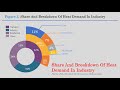 Doughnut Pie Chart in Excel - Infographic
 Multilayered Doughnut Chart : Part-1
 How to Create a Pie Chart Drill Down
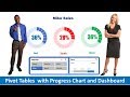 Pivot Table with Progress Chart and Dashboard
 MS PowerPoint Tutorial: Multi-Level Wheel/Doughnut Diagram (Training Provider Malaysia)
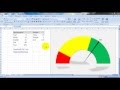 Create Speedometer Chart In Excel
 Excel - Comment réaliser un Indicateur sous la forme d'une Graphique Double Anneau
 How to Create Sunburst Chart in Excel
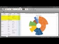 How To... Create and Modify a Sunburst Diagram in Excel 2016
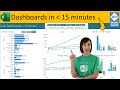 Secrets to Building Excel Dashboards in Under 15 Minutes!
 PowerBI.Tips - Tutorial - Filled Donut Chart
 How to Create Doughnut Chart with Labels Outside with Connecting Line in Chart js
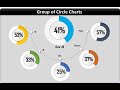 Info-graphics: Group of Circle Charts in Excel
 Make a 3D Pie Chart That Actually Looks Good on PowerPoint
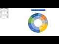 Double Doughnut Chart in Excel
 Create a Sunburst Chart
 HowTo: Multilevel Pie in Excel
 How To Create A Pie Chart In Excel (With Percentages)
 Stylish Butterfly Chart (Version-1)