Multilayered Doughnut Chart : Part-1
Hello Friends,
In this video you will learn how to create a beautiful multilayered Doughnut Chart for KPI metrics. In this chart we can display 3 or 4 KPI metrics at a time. This chart can be used in business presentations or dashboards.
Download this excel file from below given article:
https://www.pk-anexcelexpert.com/multilayered-doughnut-chart-part-1/
Watch Multilayered Doughnut chart Part-2
https://youtu.be/KKl60TosKb0
Visit to learn more:
Chart and Visualizations: https://www.pk-anexcelexpert.com/category/blogs/charts-and-visualization/
VBA Course: https://www.pk-anexcelexpert.com/vba/
Download useful Templates: https://www.pk-anexcelexpert.com/category/templates/
Dashboards: https://www.pk-anexcelexpert.com/excel-dashboard/
Watch the best info-graphics and dynamic charts from below link:
https://www.youtube.com/playlist?list=PLbDvAYjpWJ7CEAHn-iuGSeLbUtFnYekHr
Learn and free download best excel Dashboard template:
https://www.youtube.com/playlist?list=PLbDvAYjpWJ7CpupRYMRkXSN0L92t7nUuF
Learn Step by Step VBA:
https://www.youtube.com/playlist?list=PLbDvAYjpWJ7BcoaFQD-syOrZzNSLZycwH
Website:
https://www.PK-AnExcelExpert.com
Facebook:
https://facebook.com/PKAn-Excel-Expert-974812222655234/
Telegram:
https://t.me/joinchat/AAAAAE2OnviiEk5o1o8i4w
Twitter:
https://twitter.com/priyendra_kumar
Pinterest:
https://www.pinterest.com/PKAnExcelExpert/
Send me your queries on telegram:
@PKanExcelExpert
Видео Multilayered Doughnut Chart : Part-1 канала PK: An Excel Expert
Показать
Комментарии отсутствуют
Информация о видео
Другие видео канала
 Progress Circle Chart in Excel as NEVER seen before!
 Multilayered Doughnut Chart : Part-2
 Info-graphics: Group of Circle Charts in Excel
 Stylish Butterfly Chart (Version-1)
 Conditional Formatting in Stylish Doughnut Chart
 Weekly Sales chart in Excel
 Doughnut Pie Chart in Excel - Infographic
 How to Create a Multi-Layer Doughnut Chart in Excel
 Half Circle KPI info graphic chart
 Create a Doughnut Chart
 Infographics: Progress Circle Chart in Excel
 Advanced Pivot table tricks for Reporting and Analysis
 Rating Meter Chart in Excel || Five Performance Buckets || Show Process or Portfolio Health
 Dynamic Chart: Target Vs Actual Sales
 Infographics: KPI Indicators with excel cells
 ☑️ Top 25 Advanced Pivot Table Tips & Tricks For Microsoft Excel
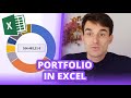 Portfolio in Excel visualisieren: Tutorial mit Thomas | Finanzfluss Twitch Highlights
 Info-graphics: Multiple KPIs Visualization in Excel