How to make a panel chart in excel - method 2
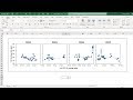
In this video I show you how to make a panel chart in excel. First add all the data to one chart. Secondly multiple/divide/add/subtract to get the data series to have the same range and to be evenly spaced out. Finally add in pretend axis using extra data series and add data labels to them to get the correct numbers.
--------------------------------------------------------------------------------
#exceltips #exceltutorial #excelcharts
SUBSCRIBE: https://goo.gl/c46YPs
Microsoft Office 365, 2016, Office Insider, Version 1904
These data are related to my masters dissertation
---------------------------------------------------------------------------------
IF YOU LIKED THIS VIDEO YOU MAY ALSO LIKE:
- How to make panel charts in excel - method 1 https://youtu.be/DAUh2Xvxt3w
- How to make a correlation matrix using a website https://youtu.be/LpxI-XCGD4o
- How to make dynamic charts in excel https://youtu.be/DAwwLbAlDTs
Видео How to make a panel chart in excel - method 2 канала Karina Adcock
Показать
Комментарии отсутствуют
Информация о видео
Другие видео канала
 How to make panel charts in excel - method 1
 How to build Interactive Excel Dashboards
 How to make in-cell bar charts in excel - 3 different ways
 SANKEY DIAGRAM TABLEAU
 How to make a chart with 3 axis in excel
 How to make panel charts in excel using sparklines
 Excel Mini Charts - Better than Sparklines!
 🔴 How to plot FTIR Data in Excel 😎😎
 Excel Charts: Matrix or Excel Panel Charts - Showing many variables at once
 Publication Quality Bar Graph in Excel for Research
 Create Panel Line Charts (Video 1)
 How to Create a Small Multiples Bar Chart in Excel
 Create a Dynamic Chart with Checkboxes
 How to quickly make multiple charts in excel
 Roll of the dice in excel
 Progress Circle Chart in Excel - Part 1 of 2
 How to make multiple charts in excel using vba
 Weekly Sales chart in Excel
 How To... Plot Multiple Data Sets on the Same Chart in Excel 2010
 Excel Combo Chart: How to Add a Secondary Axis