BobBlast 185 - "Contrast - Why Value Packs a Wallop."
Contrast - Why Value Packs a Wallop
Welcome Back to Another BobBlast!
This week's BobBlast covers three topics that are often misunderstood, sometimes forgotten and can be just plain bothersome! And they are one of the basics of art school... VALUE - CONTRAST - LIGHT SOURCE
Why are these principles important to know when creating a painting? Value can establish the mood of the painting. Soft, gentle low-value tones can be romantic or quiet. On the other hand, bright contrasting values can be dramatic, eye-popping or even harsh.
Most artists are aware of the value scale - when I was in art school, one of the assignments was to make a value scale chart from ten to zero of all twelve colors from the standard color wheel. It took a week - but boy, did I learn the lesson about value!
Hint: Color right out of the paint tube is the darkest that color will ever be. On the value scale that is a #10. The color, when lighter reads from #10 to zero.
My demo is in black and white - It is the easiest example to use because of the high contrast. But remember, any color right out of the tube is still a #10. Yes, even yellow!
When I paint, I like to use Contrast - I like to lead the viewer's eye to the contrasting point on the painting - which can be a Value of #10 next to a midtone Value of #5 or a stark dramatic Value of #1. Contrast gives your painting punch, liveliness and dimensionality.
Establishing your Light Source will also create dimension. In this BobBlast, I demo a ball, lit with a dramatic spotlight - lighting only one side of the ball and also shines on the back wall. You will hear me say "Dark Against Light, Dark Against Light" over and over again. Incorporating a light source in your paintings will give focus, shape, dimension and a point of interest!
Practice Practice Practice!
Видео BobBlast 185 - "Contrast - Why Value Packs a Wallop." канала Robert Burridge - BobBlast
Показать
Комментарии отсутствуют
Информация о видео
15 января 2018 г. 5:54:43
00:11:01
Другие видео канала
 BobBlast 186 - "Value, Light Source and Living Color!"
 BobBlast 316 - "Starting a Black and White Painting"
 BobBlast 339 - "Why Graphic Design is Important"
 BobBlast 190 "Best of BobBlast - Revisiting Collage Papers. How and Why it Works for Me."
 BobBlast 255 - "You’re So Negative! A Quick, Simple Guide how to See It."
 BobBlast 207 - "How I Get My Ideas."
 BobBlast 354 - "Horizontal Composition - Land or Sky?"
 BobBlast 290 - "Me and my Shadow."
 BobBlast 246 "Best of BobBlast Beyond Diptychs & Triptychs."
 BobBlast 247 - "Working with Charcoal and Pastels."
 BobBlast 368 - "Color Combo Lesson"
 BobBlast 324 - "Paint Sketching and Collage Combo"
 BobBlast 214 "Quick and Simple Figures - Part One."
 BobBlast 239 - "Best of BobBlast - Working with Color."
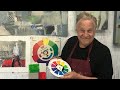 BobBlast 318 - "Put It in Neutral!"
 BobBlast 311 - "It’s Hip to be Square"
 BobBlast 337 - "The Shadow Knows..."
 BobBlast 118 "Loosen Up with Dramatic Light & Color Workshop Demonstration."
 BobBlast 327 - "Background Colors that Work."
 BobBlast 194 "Loosen Up! Two Techniques for Painting Flowers."