Stylish and Dynamic Comparison Chart | No Excel Shape or Picture used
#DynamicChart #Visulaization
Hello Friends,
In this video, you will learn how to create a stylish and dynamic comparison chart in Microsoft Excel. This chart can be used to compare the metric like -Sales, Revenue, profit, etc. between 2 years, months or quarters. In this example, we have taken Product and Year wise sales data. You can change the year using the drop-down. You can change the data labels values also using the form control option buttons.
Download the practice file from below given link:
https://www.pk-anexcelexpert.com/stylish-and-dynamic-comparison-chart/
Download the Free Project Management Dashboard
https://www.pk-anexcelexpert.com/excel-dashboard/project-management-dashboard
Download our free Excel utility Tool and improve your productivity:
https://www.pk-anexcelexpert.com/products/pks-utility-tool-v2-0/
See our Excel Products:
https://www.pk-anexcelexpert.com/products/
Visit to learn more:
Chart and Visualizations: https://www.pk-anexcelexpert.com/category/blogs/charts-and-visualization/
VBA Course: https://www.pk-anexcelexpert.com/vba/
Download useful Templates: https://www.pk-anexcelexpert.com/category/templates/
Dashboards: https://www.pk-anexcelexpert.com/excel-dashboard/
Watch the best info-graphics and dynamic charts from below link:
https://www.youtube.com/playlist?list=PLbDvAYjpWJ7CEAHn-iuGSeLbUtFnYekHr
Learn and free download best excel Dashboard template:
https://www.youtube.com/playlist?list=PLbDvAYjpWJ7CpupRYMRkXSN0L92t7nUuF
Learn Step by Step VBA:
https://www.youtube.com/playlist?list=PLbDvAYjpWJ7BcoaFQD-syOrZzNSLZycwH
Website:
https://WWW.PK-AnExcelExpert.com
Facebook:
https://www.facebook.com/PKAnExcelExpert
Telegram:
https://t.me/joinchat/AAAAAE2OnviiEk5o1o8i4w
Pinterest:
https://www.pinterest.com/PKAnExcelExpert/
Visit our Amazon Store
https://www.amazon.in/shop/pkanexcelexpert
Видео Stylish and Dynamic Comparison Chart | No Excel Shape or Picture used канала PK: An Excel Expert
Показать
Комментарии отсутствуют
Информация о видео
Другие видео канала
 5 VBA UserForm Super Tips
 Dynamic Hourly Project Planner (Gantt Chart)
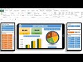 Dynamic Dashboard with Tablet and Mobile shape in Excel
 Forecasting in Excel using Linear Regression
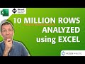 10 Million Rows of data Analyzed using Excel's Data Model
 6 FREE Add-Ins for Excel to Start Using Now
 Smart Data Entry form with minimum VBA
 Excel Tips: Highlight and Get Birthdays Count from Date of Birth
 Transport Cost Optimization Using Solver in Excel
 Comparison Chart For Dashboards... Simple and Beautiful
 Info-graphics: 3D Glass Chart in Excel
 Secrets to Building Excel Dashboards in Under 15 Minutes!
 Switch chart between monthly and quarterly in Excel | Dynamic chart reporting | Excel Off The Grid
 How to use TOPN DAX function in Power BI? | TOPN DAX | BI Consulting Pro | DAX Sundays | Power BI
 Stylish Butterfly Chart (Version-1)
 Supercharge Your Tableau Dashboard With Dynamic Pivot Tables (Swap Tables) | Tableau Tidbits
 What-If Analysis (Goal Seek, Scenario Manager and Data Table) in Excel | Step by Step tutorial
 How to Create a Stock Chart in Excel (High-Low-Close)
 Actual vs Targets Chart in Excel