
- Популярные видео
- Авто
- Видео-блоги
- ДТП, аварии
- Для маленьких
- Еда, напитки
- Животные
- Закон и право
- Знаменитости
- Игры
- Искусство
- Комедии
- Красота, мода
- Кулинария, рецепты
- Люди
- Мото
- Музыка
- Мультфильмы
- Наука, технологии
- Новости
- Образование
- Политика
- Праздники
- Приколы
- Природа
- Происшествия
- Путешествия
- Развлечения
- Ржач
- Семья
- Сериалы
- Спорт
- Стиль жизни
- ТВ передачи
- Танцы
- Технологии
- Товары
- Ужасы
- Фильмы
- Шоу-бизнес
- Юмор
How to Create Excel Sales Report Dashboard Presentation with 4 Designs
An example of an interactive sales report built in Excel
Dashboard Template: https://exceltable.com/en/templates/example-of-excel-interactive-sales-report-with-gamification
With an unconventional and engaging visualization concept.
Excel allows the creation of analytical dashboards of varying complexity — from classic KPI panels to visually expressive reporting environments. This template demonstrates how design and analytics can be combined to make sales performance analysis more dynamic and attention-focused.
The dashboard is structured for comprehensive sales evaluation and executive presentation.
At the top — KPI header cards forming a structured summary grid:
🔹 Total sales volume
🔹 Average weekly revenue per customer (ARPC)
🔹 Growth impact points
🔹 Imbalance between sales volume and implementation costs by key product categories
Above the KPI grid is a year-selection control panel built with PivotTable slicers. Multi-selection enables comparison across several historical periods simultaneously.
Each KPI card is supported by a dedicated analytical visualization block:
✔ Comparative analysis of five growth impact points
✔ ARPC dynamic curve by weekday
✔ Radar chart showing sales volume vs. cost distribution by product category
✔ Combined monthly sales and cost comparison chart with month multi-selection
✔ Conversion analysis visualization (visitors to buyers or orders to closed deals)
The dashboard also includes four visual display modes adapted to different working conditions: day, night, morning, and evening. This enhances usability while preserving analytical clarity.
Functionally, this report supports:
➡ Identification of primary growth drivers
➡ Monitoring revenue dynamics and cost structure
➡ Comparative period analysis (monthly, quarterly, yearly)
➡ Conversion efficiency evaluation
➡ Executive-level sales review
This template illustrates how Excel can move beyond static reporting into structured, interactive sales intelligence. It transforms raw performance data into a visually organized management instrument suitable for operational and strategic analysis.
#ExcelSalesDashboard
Видео How to Create Excel Sales Report Dashboard Presentation with 4 Designs канала Excel Visual
Dashboard Template: https://exceltable.com/en/templates/example-of-excel-interactive-sales-report-with-gamification
With an unconventional and engaging visualization concept.
Excel allows the creation of analytical dashboards of varying complexity — from classic KPI panels to visually expressive reporting environments. This template demonstrates how design and analytics can be combined to make sales performance analysis more dynamic and attention-focused.
The dashboard is structured for comprehensive sales evaluation and executive presentation.
At the top — KPI header cards forming a structured summary grid:
🔹 Total sales volume
🔹 Average weekly revenue per customer (ARPC)
🔹 Growth impact points
🔹 Imbalance between sales volume and implementation costs by key product categories
Above the KPI grid is a year-selection control panel built with PivotTable slicers. Multi-selection enables comparison across several historical periods simultaneously.
Each KPI card is supported by a dedicated analytical visualization block:
✔ Comparative analysis of five growth impact points
✔ ARPC dynamic curve by weekday
✔ Radar chart showing sales volume vs. cost distribution by product category
✔ Combined monthly sales and cost comparison chart with month multi-selection
✔ Conversion analysis visualization (visitors to buyers or orders to closed deals)
The dashboard also includes four visual display modes adapted to different working conditions: day, night, morning, and evening. This enhances usability while preserving analytical clarity.
Functionally, this report supports:
➡ Identification of primary growth drivers
➡ Monitoring revenue dynamics and cost structure
➡ Comparative period analysis (monthly, quarterly, yearly)
➡ Conversion efficiency evaluation
➡ Executive-level sales review
This template illustrates how Excel can move beyond static reporting into structured, interactive sales intelligence. It transforms raw performance data into a visually organized management instrument suitable for operational and strategic analysis.
#ExcelSalesDashboard
Видео How to Create Excel Sales Report Dashboard Presentation with 4 Designs канала Excel Visual
Комментарии отсутствуют
Информация о видео
24 февраля 2026 г. 20:23:09
00:01:31
Другие видео канала
 Roadmap in Excel for Project Management Presentation
 How to Create Sales Project Management Dashboard in Excel Fast Build Tutorial
 How to Make a Personal Capital Tracker Dashboard in Excel
 Why is the pie chart in every video?
 Excel Financial Dashboard for Measuring the Impact of Credit on Margin Performance
 Dashboard with Epic Burndown Chart in Excel for Agile Project Management
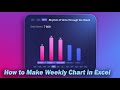 How to Create Interactive Excel Bar Chart for Flow of Closed Sales Deals Across the Week
 Interactive Excel Roadmap Progress Bar Chart for Development Stages Presentation
 Doughnut and Bubble Chart with 3 Variables Values in Excel
 How to Build Dynamic Sales Funnel Charts in Excel to Gain Sales Insights
 B2B Profitability Dashboard in Excel for Small Business Investment
 Excel Payroll Dashboard for Small Business
 Petal pie chart in Excel
 Dashboard for Marketing Analysis of Premium Packaging in Excel
 How to Create Interactive Excel Calendar for Dashboards Using Pivot Tables and Slicers
 Sales Funnel CRM Dashboard in Excel for Marketing Management
 How to Create Project Management Dashboard in Excel with Infographics
 How to Create Team Satisfaction Metric Charts in Excel for a Project Management Dashboard
 Excel Dashboard to Performance Across for Comparing Marketplace Sales with KPIs
 Chart Templates as Data Visualization Widgets for Dashboard Development
 Payroll Dashboard for Small Business Companies in Excel
