Frugal Friday: Goose That Color!
Got a tube of watercolor that just doesn't do it for you? Do what the big brands do and goose it!
Punching up the color with another pigment can help you get more useable paint. For this tube of Potters Pink, I wanted a deeper color and I wanted to reduce the shininess of the binder and increase the flow and re-wettability.
I added Turner Mars Violet to deepen the color and keep the heavy granulation and reduce the gloss from the binder as the MV is very matte in finish.
I added a small touch of QoR Quin magenta to increase re-wettability and flow.
I added W&N Permanent rose because that was the undertone I wanted.
Regrets? I have a few, OK 1. I should have picked a different QoR color because that pink was too vibrant for the look I was after and because it fills in the space around the granulating color it reduces the overall effect. I definitely recommend only mixing up a small amount and adding a tiny amount of colors because it's very easy to overdo. That said, if you have a color that dosn't work for you why not give it a try and see if you can improve it. It's yours to do with what you wish!
Bonus tips:
Cut up your test papers for embellishments and bookmarks
Save your paint caps when you use up a color in case another cap breaks.
Try a class! https://lindsayweirich.teachable.com
NEW! Podcast https://anchor.fm/lindsay-weirich
Subscribe to my blog and stay updated (upper right-hand corner) http://thefrugalcrafter.wordpress.com
Shop my favorite products on Amazon: https://www.amazon.com/shop/thefrugalcrafterlindsayweirich
Credits:
Video production and Craft ideas: Lindsay Weirich
Music: Kevin MacLeod (incompetech.com)
Licensed under Creative Commons: By Attribution 3.0
http://creativecommons.org/licenses/by/3.0/
Sign Up For The Frugal Crafter News! https://tinyletter.com/thefrugalcrafter
For Sponsorships or Product Reviews email Lindsay at: artstudiosofbangor@yahoo.com
Social media links:
Facebook: https://www.facebook.com/thefrugalcrafter
Blog: http://thefrugalcrafter.wordpress.com
Pinterest: http://pinterest.com/frugalcrafter/boards/
Twitter: https://twitter.com/lindsayweirich
Instagram: http://instagram.com/lindsayweirich
YouTube Subscribe: http://www.youtube.com/user/thefrugalcrafter?sub_confirmation=1
*This post may contain affiliate links
#thefrugalcrafter #watercolor #art
Видео Frugal Friday: Goose That Color! канала thefrugalcrafter Lindsay Weirich
Показать
Комментарии отсутствуют
Информация о видео
11 февраля 2022 г. 22:00:29
00:06:29
Другие видео канала
 Hang Out and Let's Make a Father's Day Card - Real Time Craft Along!
 Lincoln's Landscape: View of Mt Washington in Watercolor (Timelapse)
 Easy Misty Watercolor Landscape Tutorial
 Great Crayons for Broke Artists!
 Top 10 Tips for Using Cheap Watercolor Supplies! (PLUS 5 reasons cheap watercolors are great!)
 Let's Paint a Hibiscus Flower in Watercolor with Just 1 Brush! (open drip technique) EASY!
 Adorable Cat Watercolor Painting tutorial (with cheap paint!)
 Whimsical Watercolor Feather Tutorial
 Easy Easter Window Cards with Free Templates!
 paper bead xmas tree earrings
 Brush VS. Chisel/Bullet Alcohol Markers- Let's Draw a Beetle Sketchbook Sunday
 faux cloisonne jewelry box tutorial
 Are You Using This Tool Correctly? How to water based blender marker
 Stamp School #6: Tips and Tricks for Layered Rubber Stamps
 Drawing Workshop: Let's Sketch Deer in Graphitint!
 Autumn Stream Watercolor Paint On Location in Maine // Peak Fall Foliage
 I did this! Plus how to die cut a continuous border
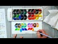 Well this is Different... Are These Weird Watercolors any Good? MIYA watercolor review
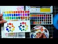 Is this even "budget"? Review of Artistro Watercolor Kit
 Beautiful Thistle in Watercolor Markers // Draw & Paint Tutorial
 New Derwent Chromaflow 72 Colored Pencil Set Update/Review