Global Biosphere March 2017 - Feb 2022
This newly updated data visualization of the Earth's Biosphere was unveiled at the 2022 United Nations Climate Change Conference (COP 27).
By monitoring the color of reflected light via satellite, scientists can determine how successfully plant life is photosynthesizing. A measurement of photosynthesis is essentially a measurement of successful growth, and growth means successful use of ambient carbon. This data visualization represents five years' worth of data taken primarily by Suomi NPP/VIIRS satellite sensors, showing the abundance of life both on land and in the sea. In the ocean, dark blue represents warmer areas where there is little life due to lack of nutrients, where yellow and orange represent cooler nutrient-rich areas. The nutrient-rich areas include coastal regions where cold water rises from the sea floor bringing nutrients along and areas at the mouths of rivers where the rivers have brought nutrients into the ocean from the land. On land, green represents areas of abundant plant life, such as forests and grasslands, while tan and white represent areas where plant life is sparse or non-existent, such as the deserts in Africa and the Middle East and snow-cover and ice at the poles.
Видео Global Biosphere March 2017 - Feb 2022 канала NASA Scientific Visualization Studio
Показать
Комментарии отсутствуют
Информация о видео
15 июня 2023 г. 0:08:34
00:00:39
Другие видео канала
 Some Like It Hot! by Tibor Kremic
 Alex Young: Sun and Moon Together Again: Helio Science from the Moon
 A Quarter Century US Forest Disturbance History from Landsat – the NAFD-NEX Products
 Earth Day 2020: Sea Surface Temperature (SST) from January 2016 through March 2020
 Curating NASA's Extraterrestrial Samples from Past and Future Sample Return Missions
 The Distributed Water Balance of the Nile Basin
 Sunny with a Chance of Space Storms by Alex Young
 Greenland's Jakobshavn Region: Simulated Ice Sheet Response Scenario RCP 8.5: 2008 - 2300
 Paula Bontempi: An Overview of Earth Science at NASA
 AGU 2023 Tuesday Introductory Remarks from AGU & NASA
 Anna Barth: Listening to Eruption Dynamics at Lone Star Gyser, Using Multivariate Sonification
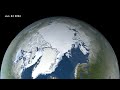 Arctic Sea Ice Minimum 2022.
 From Slime to Solutions: Monitoring water quality and cyanobacteria from space
 Explore the Literature in the New ADS
 Future of infectious diseases: How Earth observations can help predict next pandemics?
 IceFlow: Harmonizing NASA ICESat, IceBridge, and ICESat-2 data
 EXPORTS
 Jakobshavn Regional View of Simulated Greenland Ice Sheet Response Scenario - RCP 2.6: 2008 - 2300
 Warning! Local Tsunami Alert from GPS Array by Dara Goldberg
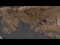 Antarctic Bedrock
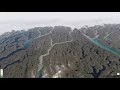 The Connected Solar System SSTP