
- Популярные видео
- Авто
- Видео-блоги
- ДТП, аварии
- Для маленьких
- Еда, напитки
- Животные
- Закон и право
- Знаменитости
- Игры
- Искусство
- Комедии
- Красота, мода
- Кулинария, рецепты
- Люди
- Мото
- Музыка
- Мультфильмы
- Наука, технологии
- Новости
- Образование
- Политика
- Праздники
- Приколы
- Природа
- Происшествия
- Путешествия
- Развлечения
- Ржач
- Семья
- Сериалы
- Спорт
- Стиль жизни
- ТВ передачи
- Танцы
- Технологии
- Товары
- Ужасы
- Фильмы
- Шоу-бизнес
- Юмор
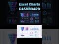
How to Compare Current and Last Year Monthly KPI Metrics in Single Excel Chart Dashboard
This Excel dashboard is designed to compare current and last year monthly KPI metrics in a single chart. Dashboard Template:
https://exceltable.com/en/templates/excel-dashboard-for-comparing-monthly-metrics-by-year
The template allows you to track:
✔ revenue,
✔ number of sales,
✔ average check,
✔ conversion rate,
✔ other key indicators in one interactive visual block.
Excel offers several powerful visualization tools specifically suited for comparing two similar values at the same time. In this video, I demonstrate how these settings work in practice using a ready-to-use interactive dashboard template.
You will see how to:
✔ visually compare performance trends,
✔ identify growth or decline,
✔ quickly evaluate dynamics by month.
✅ Compare current vs last year metrics in one chart
✅ Track revenue, sales volume, conversion, and averages
✅ Perform fast year-over-year KPI analysis
✅ Use an interactive Excel dashboard for better decisions
There is an old idea attributed to Socrates that “truth is born in debate.” In business analytics, however, truth is revealed through comparison. Any goal must be measurable, and any measurement needs a benchmark for proper evaluation. Year-over-year comparison is one of the most objective ways to understand real performance. This dashboard helps turn raw monthly data into clear visual insight for managers, analysts, and business owners.
#ExcelCompareChart
Видео How to Compare Current and Last Year Monthly KPI Metrics in Single Excel Chart Dashboard канала Excel Visual
https://exceltable.com/en/templates/excel-dashboard-for-comparing-monthly-metrics-by-year
The template allows you to track:
✔ revenue,
✔ number of sales,
✔ average check,
✔ conversion rate,
✔ other key indicators in one interactive visual block.
Excel offers several powerful visualization tools specifically suited for comparing two similar values at the same time. In this video, I demonstrate how these settings work in practice using a ready-to-use interactive dashboard template.
You will see how to:
✔ visually compare performance trends,
✔ identify growth or decline,
✔ quickly evaluate dynamics by month.
✅ Compare current vs last year metrics in one chart
✅ Track revenue, sales volume, conversion, and averages
✅ Perform fast year-over-year KPI analysis
✅ Use an interactive Excel dashboard for better decisions
There is an old idea attributed to Socrates that “truth is born in debate.” In business analytics, however, truth is revealed through comparison. Any goal must be measurable, and any measurement needs a benchmark for proper evaluation. Year-over-year comparison is one of the most objective ways to understand real performance. This dashboard helps turn raw monthly data into clear visual insight for managers, analysts, and business owners.
#ExcelCompareChart
Видео How to Compare Current and Last Year Monthly KPI Metrics in Single Excel Chart Dashboard канала Excel Visual
Комментарии отсутствуют
Информация о видео
4 декабря 2025 г. 16:21:57
00:02:59
Другие видео канала
 Employee Salary Rank Chart in Excel Payroll Dashboard
 Roadmap in Excel for Project Management Presentation
 How to Create Sales Project Management Dashboard in Excel Fast Build Tutorial
 How to Make a Personal Capital Tracker Dashboard in Excel
 Why is the pie chart in every video?
 Excel Financial Dashboard for Measuring the Impact of Credit on Margin Performance
 Dashboard with Epic Burndown Chart in Excel for Agile Project Management
 How to Create Interactive Excel Bar Chart for Flow of Closed Sales Deals Across the Week
 Interactive Excel Roadmap Progress Bar Chart for Development Stages Presentation
 Doughnut and Bubble Chart with 3 Variables Values in Excel
 How to Build Dynamic Sales Funnel Charts in Excel to Gain Sales Insights
 B2B Profitability Dashboard in Excel for Small Business Investment
 Excel Payroll Dashboard for Small Business
 Petal pie chart in Excel
 Dashboard for Marketing Analysis of Premium Packaging in Excel
 How to Create Interactive Excel Calendar for Dashboards Using Pivot Tables and Slicers
 Sales Funnel CRM Dashboard in Excel for Marketing Management
 How to Create Project Management Dashboard in Excel with Infographics
 How to Create Team Satisfaction Metric Charts in Excel for a Project Management Dashboard
 Excel Dashboard to Performance Across for Comparing Marketplace Sales with KPIs
 Chart Templates as Data Visualization Widgets for Dashboard Development
