How to Make an Excel Pie Chart
See how to make an Excel pie chart, and format it.
A pie chart shows amounts as a percentage of the total amount. Other charts, such as a bar chart or a column chart, are better for showing the differences between amounts.
If you need a pie chart, create a simple one, without special effects like 3-D. Then format the data labels, so data is easy to understand.
Get the pie chart file from my site
https://www.contextures.com/excelpiechartexamples.html
Video Timeline
00:00 Compare Data
00:33 Set Up Data
00:55 Create Pie Chart
01:24 Move & Resize
01:50 Add Labels
02:50 Format Labels
Instructor: Debra Dalgleish, Contextures Inc.
Get Debra's weekly Excel tips: http://www.contextures.com/signup01
More Excel Tips and Tutorials: http://www.contextures.com/tiptech.html
#ContexturesExcelTips
VIDEO TRANSCRIPT
With a pie chart in Excel, you can see a representation of the total amount, and the percentage that each value has of that total.
It might be easier to compare the values, if you create a bar chart such as this one, which easily shows the difference between each region, or in a column chart like this one.
But if you need to create a pie chart, we'll see the steps for creating one that's easy to read, and presents the data as clearly as possible.
The first step is to set up the data. On this sheet, I have the names of four regions, and in the column to the right,the numbers which represent the sales in each of those regions.
A pie chart can only show one set of numbers, so we couldn't compare year to year for each region, but we can see the total sales for the current year.
To create the chart, I'm going to select any cell in this table, and on the Ribbon, I'll go to the Insert tab, and click Pie
And I'm going to select this first pie chart, which is just a simple pie chart. I don't want an exploded pie or a pie of pie and certainly not a 3D pie, because those can distort the data, with the way that they create angles.
I'm going to click this one and it puts a chart right in the middle of the worksheet.
You can move it, and you can resize it, and to move it just point to one of the borders or point somewhere.
You'll notice where I'm pointing, a pop up says Chart Area. So if I point there, I can drag it to the right or left.
And I can also make it smaller, by pointing to one of the handles on the sides or in the corner. Pull the handle in or pull it out to make it bigger.
We have colored slices on this pie and a legend tells us what each color represents. To read that, people have to look at the color here, and then try and find it in the legend.
So it's better if you have these labels right on the slices, or just beside them. We're going to get rid of this legend, and put data labels onto the pie.
Now this pie only has four slices. You shouldn't try to show too much in a pie chart, or it'll just get so crowded you won't even be able to read it.
So with this pie chart, I'm going to right click, and click Add Data Labels, and that puts the value.
We can see the values here, and it's just put that on each slice. So it's a start. It's not telling us what region it is yet, but we're going to fix that up in a minute.
Next I'll delete this legend, because we're not going to need it. I'll right-click on the legend, and click Delete, and that shifts the pie over into the center.
And now we have a little more room to put things onto the slices. I'll right click on one of these labels and Format Data Labels.
In this Format Data Labels window, Label Options is selected, and I have check boxes that I can use to put things onto the label.
I don't want to put too much, or it'll just be crowded and hard to read. Right now, it's showing the value. I could also add the percentage.
For this slice, it shows 400 as the value, and 35% of the total value. I would also like to see the region name, so I'll check Category, and I'm going to take out the value and just leave it with the region name and the percentage.
I can also position those labels. Right now, it came up, the default is Best Fit, so it will put that label where it has most amount of room.
You could put them in the center of each slice, the inside end, outside or best fit, and I'll close this window.
Now I'm going to do a little more formatting on these labels, so they're easier to read.
I'll right click, and in this Formatting ribbon, I'm going to choose a white font, because it will provide a better contrast with the dark background.
I'll make those labels bold and maybe go up a little in size, so you can experiment. As I point to each size, it shows what it will look like. So 12 might be a little too big. Maybe go with 11.
Now you've got a pie chart where everything's easy to read. The labels are right on the slice, so you don't have to look back and forth from a legend to try and figure things out, so it's a good representation of the data.
Видео How to Make an Excel Pie Chart канала Contextures Inc.
Показать
Комментарии отсутствуют
Информация о видео
Другие видео канала
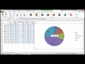 Chart in Excel - Pie Chart and Line Graph
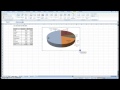 Creating Pie Chart and Adding/Formatting Data Labels (Excel)
 How To Create A Pie Chart In Excel (With Percentages)
 Microsoft Excel Tutorial for Beginners | Excel Training | Excel Formulas and Functions | Edureka
 Infographics: Progress Circle Chart in Excel
 How to Make a Pie Chart in Excel
 Microsoft Excel Tutorial - Beginners Level 1
 Make a Clustered Stacked Chart in Excel
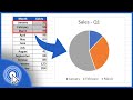 How to Make a Pie Chart in Excel
 Excel: how to create a table and pie graph (prepared for CIS 101 - student budget example)
 Create a Pie of a Pie or Bar of a Pie Chart
 How to Make an E-Commerce Website in India - Build an Online Store
 MS Excel - Advanced Filtering with Dates
 How to solve the problem of numbers not summing up in excel
 Fix Messy Entries with Excel PROPER Function
 Progress Circle Chart with Conditional Formatting - Part 2 of 2
 Easiest Excel Waterfall Chart (Bridge graph) from Scratch - Works with minus values
 Clustered Stacked Bar Chart In Excel
 How To Create A Excel Pie Chart with Percentages (in 5 Minutes!)