Bad typography has ruined more than just the Oscars
How bad graphic design changed award shows, elections, and your medicine cabinet.
The 2017 Oscars ended with a pretty shocking mix-up. Announcer Warren Beatty incorrectly named La La Land as the Best Picture winner, and the mistake wasn't revealed until crew members had already started giving their acceptance speeches. A lot of things went wrong for the snafu to happen the way it did. But what if typography was one of them? A better announcement card design could have made for a very different Academy Awards show — not to mention a much less embarrassing Miss Universe show for Steve Harvey back in 2015. But the implications of bad typography don't end there: poorly designed ballots in the 2000 presidential election arguably could have swayed the outcome, and illegible type on medicine bottles could be causing nearly 500,000 cases of drug misuse per year in the U.S.
Subscribe to our channel! http://goo.gl/0bsAjO
Vox.com is a news website that helps you cut through the noise and understand what's really driving the events in the headlines. Check out http://www.vox.com to get up to speed on everything from Kurdistan to the Kim Kardashian app.
Check out our full video catalog: http://goo.gl/IZONyE
Follow Vox on Twitter: http://goo.gl/XFrZ5H
Or on Facebook: http://goo.gl/U2g06o
Видео Bad typography has ruined more than just the Oscars канала Vox
Показать
Комментарии отсутствуют
Информация о видео
Другие видео канала
 Why this font is everywhere
 Where babies in movies come from
 It's not you. Bad doors are everywhere.
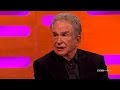 Warren Beatty Talks About That Oscars Best Picture Mistake - The Graham Norton Show
 Jimmy Kimmel Reveals What Really Happened at Craziest Oscars Ever
 Where the "comic book font" came from
 What makes a truly great logo
 The story behind this iconic Olympics protest
 The problem with America's college entrance exam
 Why some Asian accents swap Ls and Rs in English
 How the Best Picture Oscar Winner Snafu Happened
 From spy to president: The rise of Vladimir Putin
 Beginning Graphic Design: Typography
 Why the US drinking age is 21
 How America could lose its allies | 2020 Election
 Inside North Korea's bubble in Japan
 Why safe playgrounds aren't great for kids
 Are The Oscars Rigged? | The Art Of Film
 Why danger symbols can’t last forever
 The surprising pattern behind color names around the world