- Популярные видео
- Авто
- Видео-блоги
- ДТП, аварии
- Для маленьких
- Еда, напитки
- Животные
- Закон и право
- Знаменитости
- Игры
- Искусство
- Комедии
- Красота, мода
- Кулинария, рецепты
- Люди
- Мото
- Музыка
- Мультфильмы
- Наука, технологии
- Новости
- Образование
- Политика
- Праздники
- Приколы
- Природа
- Происшествия
- Путешествия
- Развлечения
- Ржач
- Семья
- Сериалы
- Спорт
- Стиль жизни
- ТВ передачи
- Танцы
- Технологии
- Товары
- Ужасы
- Фильмы
- Шоу-бизнес
- Юмор
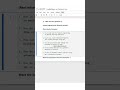
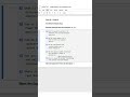
Top 5 Excel + Matplotlib Shortcuts for Data Visualization! 📊⚡ #ExcelShortcuts #Matplotlib #DataVisu
Excel + Matplotlib = Quick visuals + Full customization power 🎯
Alt + F1 + plt.plot()
Quickly create a chart in Excel or generate a line chart in Matplotlib for instant visualization.
F11 + plt.bar()
Excel creates a full-sheet chart, while Matplotlib can produce detailed bar charts with customizable size.
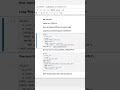
Alt + J + C + A + plt.pie()
Change your chart type instantly — Excel does it with menus, Matplotlib does it with a single function.
Ctrl + 1 + Titles/Labels
Customize chart design in Excel or define title and axis labels in Matplotlib for clarity.
Ctrl + Shift + F3 + plt.legend()
Add labels easily in Excel or legends in Matplotlib for professional-looking visuals.
Both tools make your data speak visually — Excel for quick insights, Matplotlib for storytelling precision.
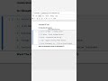
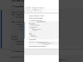
Interview Questions & Answers
What is the Excel shortcut to instantly create a chart?
– Answer: Alt + F1
Which Python library is used for creating visualizations similar to Excel charts?
– Answer: Matplotlib
How do you change a chart type in Excel and in Matplotlib?
– Answer: Alt + J + C + A in Excel; use different plotting functions like plt.bar(), plt.pie() in Matplotlib.
Which shortcut opens chart formatting in Excel, and what’s the Matplotlib equivalent?
– Answer: Ctrl + 1 in Excel; use plt.title(), plt.xlabel(), and plt.ylabel() in Matplotlib.
How do you add labels or legends to a chart in Excel and Matplotlib?
– Answer: Ctrl + Shift + F3 in Excel; plt.legend() in Matplotlib.
Видео Top 5 Excel + Matplotlib Shortcuts for Data Visualization! 📊⚡ #ExcelShortcuts #Matplotlib #DataVisu канала CodeVisium
Alt + F1 + plt.plot()
Quickly create a chart in Excel or generate a line chart in Matplotlib for instant visualization.
F11 + plt.bar()
Excel creates a full-sheet chart, while Matplotlib can produce detailed bar charts with customizable size.
Alt + J + C + A + plt.pie()
Change your chart type instantly — Excel does it with menus, Matplotlib does it with a single function.
Ctrl + 1 + Titles/Labels
Customize chart design in Excel or define title and axis labels in Matplotlib for clarity.
Ctrl + Shift + F3 + plt.legend()
Add labels easily in Excel or legends in Matplotlib for professional-looking visuals.
Both tools make your data speak visually — Excel for quick insights, Matplotlib for storytelling precision.
Interview Questions & Answers
What is the Excel shortcut to instantly create a chart?
– Answer: Alt + F1
Which Python library is used for creating visualizations similar to Excel charts?
– Answer: Matplotlib
How do you change a chart type in Excel and in Matplotlib?
– Answer: Alt + J + C + A in Excel; use different plotting functions like plt.bar(), plt.pie() in Matplotlib.
Which shortcut opens chart formatting in Excel, and what’s the Matplotlib equivalent?
– Answer: Ctrl + 1 in Excel; use plt.title(), plt.xlabel(), and plt.ylabel() in Matplotlib.
How do you add labels or legends to a chart in Excel and Matplotlib?
– Answer: Ctrl + Shift + F3 in Excel; plt.legend() in Matplotlib.
Видео Top 5 Excel + Matplotlib Shortcuts for Data Visualization! 📊⚡ #ExcelShortcuts #Matplotlib #DataVisu канала CodeVisium
Комментарии отсутствуют
Информация о видео
13 октября 2025 г. 18:23:56
00:00:06
Другие видео канала