Create a Pareto Chart with a Target Line
This video shows you how to create a Pareto chart with a target line to show the 80 percent mark. This is an enhancement to the 80-20 rule of this chart visualization by helping you with the analysis of what the data should drive to. The target marker line is quite easy to add! This line is visually better since it covers the whole plot area and doesn't look like it another part of the "data" in the chart.
🔔 SUBSCRIBE to my channel ➜ https://goo.gl/wN3c3p
🏫 Excel Training ➜ https://www.exceltraining101.com/p/tr...
📚 Excel Books & Tech Gear ➜ https://www.amazon.com/shop/dough
⚙️ Tools: Screencasting ➜ https://techsmith.z6rjha.net/5Qe53
⚙️ Tools: Microsoft Office ➜ https://microsoft.msafflnk.net/rKL0G
⚙️ Tools: TubeBuddy ➜ https://www.tubebuddy.com/et101
📝 This description may contain affiliate links and we'll receive a small commission if a purchased is made using the links (but at no additional cost to you). It'll support the channel and so more videos like this can be made. Thanks for your support!
🎁 If you find these videos useful and want to support my channel go to https://www.patreon.com/DoughExcel
#excel
#msexcel
#doughexcel
Видео Create a Pareto Chart with a Target Line канала Doug H
Показать
Комментарии отсутствуют
Информация о видео
Другие видео канала
 Create a Pareto Chart
 How to Create A Pareto Chart Like A Pro in Excel | Pareto Principle Example
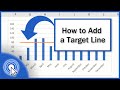 How to Add a Target Line in an Excel Graph
 Target Chart 2 - for Unique Targets
 How to use Breakout Rooms in Zoom Video Conferencing
 Create A Pareto Chart In Power BI Using DAX Function Combinations
 How to add a line to your column chart
 How to Create a Dynamic TARGET LINE in Excel Chart
 Create a Dynamic Chart Title Sourced from Pivot Table & Slicer
 如何使用Office365的Excel畫出專業且正確的【柏拉圖(Pareto chart)】
 Pareto Diagram: Simple
 Properly Create Surveys with Microsoft Forms & Export to Excel
 Advanced Pivot Table Techniques (to achieve more in Excel)
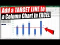 How to Add a Target Line to a Column Chart (2 Methods)
 Pareto Analysis for Problem Solving
 How to create a Pareto Chart in Excel - 80/20 Rule or Pareto Principle
 柏拉圖 (Pareto) - 來自於 80/20 法則的神奇圖表 | Excel 教學 #33
 Tableau Custom Charts- Pareto chart
 Create a Basic Burn-up Chart
 How to Create a Dynamic Pareto Chart in Excel