Responsive Menu With Media Queries (Checkbox Trick) - Using Only CSS3
Responsive Menu With Media Queries (Checkbox Trick) - Using Only CSS3 - Code Tutorial
This tutorial will teach you how to take a normal navigation and make it responsive with breakpoints. At a specific screen width the navigation will change to a mobile hamburger menu style nav.
We will also be using a checkbox trick to open and close the menu without any javascript or jquery.
This code is simple and takes a few minutes to put into any code project. Let me know if this helped in the comments :D
Have a great day and don’t forget to Like,Share the video and Subscribe for NEW VIDEOS every Week!
Subscribe- http://www.youtube.com/user/CalerEdwards?sub_confirmation=1
Source Code: http://www.mediafire.com/file/pz01z4424cx86d6/Responsive_Menu_With_Media_Queries.zip
Used:
Brackets
Previous Video:
https://youtu.be/nws05s9xM14
My Links:
Website- http://caleredwards.com
Dribbble- https://dribbble.com/CalerEdwards
Facebook- https://www.facebook.com/CalerEdwards/
Behance- http://behance.net/CalerEdwards
GooglePlus- https://plus.google.com/u/0/+CalerEdwards
Видео Responsive Menu With Media Queries (Checkbox Trick) - Using Only CSS3 канала Caler Edwards
Показать
Комментарии отсутствуют
Информация о видео
Другие видео канала
 Step up your front-end skills with these 5 resources
 Dropdown Log In Form with Navigation bar and Logo using HTML 5, CSS 3 and jQuery
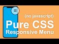 Responsive Pure CSS Menu Tutorial (No Javascript)
 How to Create Responsive Navigation Bar using HTML and CSS
 Pure CSS Hamburger Menu & Overlay
 Responsive Menu with Only HTML and CSS | No JavaScript | Responsive Navbar
 Create a responsive navigation nav with no JS!
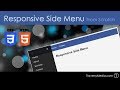 Responsive HTML & CSS Side Menu From Scratch
 Responsive Navigation Menu Bar using HTML & CSS | CSS Media Query
 Responsive Navigation Bar With Html CSS and Javascript - Responsive Sidebar Menu For Mobile
 Animated Hamburger Menu Tutorial - CSS Effects
 Flexbox CSS In 20 Minutes
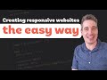 Responsive design made easy
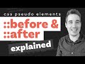 Before and After pseudo elements explained - part one: how they work
 Container queries are possible!
 Learn CSS Media Query In 7 Minutes
 Pure CSS Sidebar Toggle Menu Tutorial in Hindi / Urdu
![[TUTO]Animated Hamburger Menu Icon || Transforming on click](https://i.ytimg.com/vi/2hENWMfzl4c/default.jpg) [TUTO]Animated Hamburger Menu Icon || Transforming on click
[TUTO]Animated Hamburger Menu Icon || Transforming on click How to change your Squarespace mobile site using media queries // Squarespace CSS Tutorial
 Transforming Hamburger Menu - Animated Toggle Menu Effect - Transforming Hamburger Icons Tutorial