Tips on How to Select Colors for a Basic Watercolor Palette
My New Pen & Ink Drawing Workbook: https://amzn.to/2CZjLVp
---------------------------------------------------------------------------------
My First Book: http://bit.ly/dunnbook1
---------------------------------------------------------------------------------
SOCIAL MEDIA
https://www.facebook.com/AlphonsoDunnDrawing/
Instagram: http://www.instagram.com/alphonsodunn
Twitter: http://www.twitter.com/alphonsodunnart
---------------------------------------------------------------------------------
Colors I discussed in this video:
List of colors in this pic:
Reds: PR255-pyrrole scarlet, PR254-pyrrole red, PV122-quinacridone magenta
Blues: PB29-ultramarine,PB15:3-phthalo blue (green shade), PB16-phthaloturquoise
Yellows: PY154-benzimidazalone yellow, PY65-hansa yellow deep, PY35-cadmium lemon
Green: PG7/36- phthalo green blue and yellow shade
Violet: PV16 manganese violet
Earthcolors: PY42-yellow ochre, PBr7-burnt sienna
Neutral: Sepia (contains PBK9, PB15.1, PBR7)
In this tutorial I share some tips on key things to consider as you begin to put together a basic but effective palette of watercolor paints. What colors are essential? What should you definitely be included? What colors don't have to be? How do you determined that? Whats the reasoning behind these decisions? etc. I'll share my perspective that will hopefully provide a basic understanding of the essentials you need to know to apply to your color mixing whether you use acrylics, oil, gouache, or watercolor. Color theory in painting is essentially similar across the media
See my other videos on watercolor, drawing, anatomy, pen and ink drawing tips, tricks, and techniques :-)
Видео Tips on How to Select Colors for a Basic Watercolor Palette канала Alphonso Dunn
---------------------------------------------------------------------------------
My First Book: http://bit.ly/dunnbook1
---------------------------------------------------------------------------------
SOCIAL MEDIA
https://www.facebook.com/AlphonsoDunnDrawing/
Instagram: http://www.instagram.com/alphonsodunn
Twitter: http://www.twitter.com/alphonsodunnart
---------------------------------------------------------------------------------
Colors I discussed in this video:
List of colors in this pic:
Reds: PR255-pyrrole scarlet, PR254-pyrrole red, PV122-quinacridone magenta
Blues: PB29-ultramarine,PB15:3-phthalo blue (green shade), PB16-phthaloturquoise
Yellows: PY154-benzimidazalone yellow, PY65-hansa yellow deep, PY35-cadmium lemon
Green: PG7/36- phthalo green blue and yellow shade
Violet: PV16 manganese violet
Earthcolors: PY42-yellow ochre, PBr7-burnt sienna
Neutral: Sepia (contains PBK9, PB15.1, PBR7)
In this tutorial I share some tips on key things to consider as you begin to put together a basic but effective palette of watercolor paints. What colors are essential? What should you definitely be included? What colors don't have to be? How do you determined that? Whats the reasoning behind these decisions? etc. I'll share my perspective that will hopefully provide a basic understanding of the essentials you need to know to apply to your color mixing whether you use acrylics, oil, gouache, or watercolor. Color theory in painting is essentially similar across the media
See my other videos on watercolor, drawing, anatomy, pen and ink drawing tips, tricks, and techniques :-)
Видео Tips on How to Select Colors for a Basic Watercolor Palette канала Alphonso Dunn
Показать
Комментарии отсутствуют
Информация о видео
Другие видео канала
 My Favorite 8 Colors for Watercolor
 Color Theory & Color Mixing E1 | A simple introduction for watercolor beginners
 How to choose a new portable watercolor set for beginners
 Beginner Watercolor Exercises | How to Paint Small Details
 Building the PERFECT WATERCOLOR PALETTE
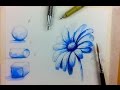 Beginner Watercolor Value Exercise | How to Paint Monochromatic Flowers
 Almost All my Watercolour Palette Boxes (2018)
 Setting up a new Watercolor Palette! | step-by-step
 How to Avoid Muddy Colors when Painting - Color Mixing Secrets Demystified for Beginners
 My WATERCOLOR PALETTE Set Up and Color Choices!
 How to Draw & Paint Flowers with Ink and Watercolor Part 1
 Micro Palette and 6 Colors I Chose to Put In
 How to Use Complementary Colors in Watercolor Painting
 A Look at the Watercolor Brushes I'm Using
 Using Phthalo Blue & Green in Watercolor
 Watercolor Primaries | Red Blue Yellow vs Magenta Cyan Yellow
 Top 12 Perfect Travel Palette Colors / Top 12 Color Recommendations for a Limited Palette
 Daniel Smith Watercolors - Why the Big Fuss?
 My Top 10 Favorite Watercolor Brands | Professional & Student Grade Recommendations