Using Excel - Making a Scatter Plot, Finding the Line of Best Fit, and the Correlation Coefficient
In this video, we take a data set and insert a scatter plot, trendline, equation of the trendline, and then use the formula to calculate the correlation coefficient (r).
Видео Using Excel - Making a Scatter Plot, Finding the Line of Best Fit, and the Correlation Coefficient канала Scott Shelton
Видео Using Excel - Making a Scatter Plot, Finding the Line of Best Fit, and the Correlation Coefficient канала Scott Shelton
Показать
Комментарии отсутствуют
Информация о видео
Другие видео канала
 Excel Scatter Plot Tutorial
 Calculating the Correlation Coefficient and Best Fit Regression Using Google Sheets
 Scatter plot in Excel with trendline
 Using Google Sheets to create scatter plot, line of best fit and r^2
 Using Excel to calculate the correlation coefficient
 How to calculate the significance of the Spearman's correlation in excel
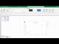 Making a scatter graph and line of best fit in Excel
 Using the Flexible Spline function (FlexSpline) in Excel
 Scatterplots and Correlation in Excel 2016
 Excel Basics - Linear Regression - Finding Slope & Y Intercept
 Gr 11 Statistics - Determining Outliers (Scatter Plot)
 Correlation Coefficient in Excel
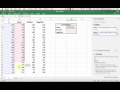 Using Excel to calculate a correlation coefficient || interpret relationship between variables
 Spearman's Rank Correlation Coefficient in Excel
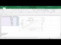 Creating a Line of Best Fit on Excel
 How to Calculate a Correlation in Microsoft Excel - Pearson's r
 Computing the Correlation Coefficient On Excel different ways
 Making a Dot Plot in Excel
 How to Make a Scatter Plot in Excel
 Correlation analysis using Excel