A Time-Lapse Map of Every Death From the Coronavirus Pandemic (Up to July 2020)
This is an audio-visual time-lapse of every death from the Coronavirus pandemic from January to June 2020. Inspired by Isao Hashimoto's “A Time-Lapse Map of Every Nuclear Explosion Since 1945”; each country is represented by a tone and an expanding blip on the map when a death from Covid-19 is recorded. Each day is 4 seconds long, and at the top of the screen is the date and a counter showing the total numbers of deaths. Every country that has had a fatality is included.
🎧 Headphones recommended 🎧
Like the outbreak of Coronavirus, this work starts in China and it starts slowly. But of course, it rapidly spreads. The piece starts to rapidly pick up at around the 3:30 mark but I strongly recommended watching the whole piece from the beginning to truly experience the overwhelming scale. The virus grows continuing to work its way throughout the world until the end of June - where this piece ends but the real virus has not. At the time of uploading this Covid-19 has claimed over 500,000 deaths worldwide (750,000 as of August 13th 2020). It is likely a sequel will need to be made.
This work was emotionally a difficult piece to write and may be upsetting to some people. I created it to highlight the terrifying spread of this virus and to try and understand how frightening its exponential growth has been. There seems to be something much more real and chilling about these numbers when you hear them, as well as seeing them.
There are no words in this piece, only symbols, numbers, and flags. I would like this to be understood and seen by as many people around the world as possible from all countries and cultures. Sometimes there are no words for terrible events like this. If you are available to help me translate this description for other languages then please do get in touch via my YouTube or Instagram channels.
Dedicated to every person that tragically lost their lives to Covid-19.
Music and animation by James Beckwith.
Thanks for watching and subscribe for more videos.
——————————
FURTHER DETAILS:
I chose the date format (YYYY-MM-DD) because of the Europe/North America difference between the layout of month and day. I hope this version is the clearest.
Each country’s audio is panned at its perceived place on the world map e.g. USA is left, Japan is right, UK in the center etc.
The tonal choices were roughly ordered with the main epicentre of the virus being in the middle range (Europe), with countries less affected in the higher register. Mexico and South America are mostly lower notes which sweep in towards the end of the piece as the epicentre of the virus shifts to the Americas.
Several territories & microstates (e.g. Hong Kong) were included where deaths occurred, and two cruise ships - the Diamond Princess and MS Zaandam. These are represented by the Carnival Cruise Line flags at the end.
At the end of the piece is the breakdown of deaths per country as of June 30th, 2020, represented by each countries official flag.
All instruments were made with the Retro Synth plugin in Logic Pro.
The ethereal reverb sound is an audio plugin called Valhalla Shimmer.
Music was created in Logic Pro, and animation in Adobe After Effects.
For more (less bleak) content, subscribe and check out my YouTube channel.
I am a musician and composer based in London, UK.
——————————
SOCIAL MEDIA:
https://www.youtube.com/c/jamesbeckwith1
https://www.jamesbeckwith.com
https://instagram.com/iamjamesbeckwith
https://jamesbeckwith.bandcamp.com
——————————
DISCLAIMER:
This is created by the official data that countries have reported as of July 1st, 2020. This piece is portrayed as accurately as possible, painstakingly copying over 20,000 lines of data - although there are a few artistic licences. The data is primarily gathered from the COVID-19 Tracker from the London School Of Hygiene & Tropical Medicine, with backup data from Johns Hopkins University, Our World In Data, and Worldometers. As of uploading this (July 4th, 2020) it is likely updated and slightly different from what is portrayed here. There are likely many more cases that are unconfirmed and there are discrepancies and changes since between countries, organisations, and studies. Sadly there are also likely more deaths than documented, particularly in countries that have less reliable reporting methods or are suppressing the data.
——————————
SOURCES:
A Time-Lapse Map of Every Nuclear Explosion: https://www.youtube.com/watch?v=LLCF7vPanrY
Johns Hopkins: https://coronavirus.jhu.edu/map.html
London School Of Hygiene & Tropical Medicine: https://vac-lshtm.shinyapps.io/ncov_tracker/
Map Chart: https://mapchart.net/
Our World In Data: https://ourworldindata.org/coronavirus
Valhalla Shimmer Audio Plugin: https://valhalladsp.com/shop/reverb/valhalla-shimmer/
World Health Organization: https://www.who.int/news-room/detail/
27-04-2020-who-timeline---covid-19
Worldometer: https://www.worldometers.info/coronavirus
℗© 2020 James Beckwith
Видео A Time-Lapse Map of Every Death From the Coronavirus Pandemic (Up to July 2020) канала James Beckwith
Показать
Комментарии отсутствуют
Информация о видео
Другие видео канала
 Time-Lapse Map of Every Nuclear Explosion Type Beat | Akira The Don
 "1945-1998" by ISAO HASHIMOTO
 Every nuclear bomb explosion in history
 Land Of The "Freer": A Music Timelapse of US Election 2020 (Lift Every Voice and Sing)
 A STORM OF COLOR Time Lapse - Isolated Supercell, tornado, rainbow and lightning storm
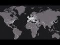 Timelapse of Every Battle in History
 A Time-Lapse Map of Every Nuclear Explosion Since 1945 - by Isao Hashimoto
 A Strange Object Is Circling Earth Like a Second Moon
 Road Trip Time Lapse Across The Loneliest Road in America
 How To Play: Harder Better Faster Stronger on Vocoder (Daft Punk)
 A Timeline of All Historical US Presidential Elections (1789 - 2016)
 Amazing Visual Loops Compilation 4K 🔥🔥 || Extended Version
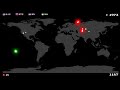 Every Nuclear Detonation Time-lapse Video 1945-1997
 COVID-19 vaccine: An end to the pandemic?
 Echodrone - Time
![My Best Timelapse so Far [Part 03] - WWII Hoi4](https://i.ytimg.com/vi/OYUXgjDT9w4/default.jpg) My Best Timelapse so Far [Part 03] - WWII Hoi4
My Best Timelapse so Far [Part 03] - WWII Hoi4 Best of 2020 Time lapses.
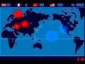 A Time Lapse Map of Every Nuclear Explosion Since 1945 by Isao Hashimoto
![[10 Hours] Fractal Animations Electric Sheep - Video Only [1080HD] SlowTV](https://i.ytimg.com/vi/t6jlhqNxRYk/default.jpg) [10 Hours] Fractal Animations Electric Sheep - Video Only [1080HD] SlowTV
[10 Hours] Fractal Animations Electric Sheep - Video Only [1080HD] SlowTV Texas does the Cha Cha Slide