Lighting 101: Contrasting with Color
Stay tuned to the end for a chance to win a prize!
Contrast is one of the main components of great cinematography. Contrast usually refers to the difference between the dark parts of your frame and the bright parts of your frame. But did you know that you can also create contrast with color as well as brightness? These differences in light and color will help guide your audience’s eye and make the image more visually interesting. Today on 4 Minute Film School, we are going to explore color contrast by shooting two scenes, looking at two different types of color contrast.
In this video, Matt from the A-Team walks us through how to approach color contrast in your scene. First, he looks at what he has to work with in the scene. Sometimes the color of a light that already exists in your scene will influence what color contrast you use, whether it be sunlight or a green neon sign. Second, he identifies what color contrast would make the most sense in the scene. Even if two colors look good together, they won’t always make sense with the situation the scene takes place in. Lastly, he modifies the light to produce the colors that he wants for the scene. This is done either by gelling lights or using lights with different colors built in.
The main techniques used in this video are mixing colors, color temperature, and color combination. Mixing colors is the basis of color contrast. Having more than one color of light in your shot will help guide the viewer’s eyes to different parts of the image. This can also add dimension to the frame. Color temperature is a way of measuring colors of lights. Depending on your camera settings, color temperature will have a big impact on how your lights appear on screen. Color combinations are the creative choices associated with color contrast. There are certain color combinations that look better to the human eye than others, but you can experiment with different combinations to find what you like best.
Color contrast is a very simple way to make your images more interesting. Often times you don’t have to try too hard to get color contrast, because there’s color contrast all around in everyday life. And sometimes all you have to do your lighting setup is throw some gels on your light. Ultimately, creating color contrast is a very simple way to take your lighting setups to the next level. Now, as you go about your day and as you watch movies, take note of the color contrast in the lighting. You might be inspired to add color contrast to your own shots!
Connect with Matt: https://www.instagram.com/mozaicstudios/
Connect with Anes: https://www.instagram.com/honestlyanes/
Connect with Ronee: https://www.instagram.com/roneecollins/
Connect with Chetco: https://www.instagram.com/thechetco/
Want more free lighting and cinematography tutorials? Subscribe to us so you never miss an episode: https://goo.gl/QwazdM
🎥How to Light the Cinematic Film Look!
https://youtu.be/oy2wGhuVqoY
🎥Free Cinematography Lessons From Experts!
https://www.youtube.com/playlist?list...
🎥Subscribe to Aputure:
https://www.youtube.com/aputurephoto
https://www.facebook.com/aputure
https://www.instagram.com/aputuretech
https://www.twitter.com/aputuretech
🎥Connect with the A-Team!
Ted - https://instagram.com/aputure_ted
Benny - https://instagram.com/aputure_benny
🎥GET APUTURE GEAR:
https://aputure.com
🎥MERCH:
https://represent.com/store/aputure
🎥MUSIC:
http://bit.ly/pb_aputure
🎥GRAPHICS:
http://bit.ly/Aputure_RS
Summary:
Aputure's YouTube channel provides free high-quality cinematography, lighting, and filmmaking educational content to help you take your film projects to the next level.
Видео Lighting 101: Contrasting with Color канала Aputure
Показать
Комментарии отсутствуют
Информация о видео
Другие видео канала
 Roger Deakins on "Learning to Light" — Cinematography Techniques Ep. 1
 Cinematic Lighting 101 | How to Light Faces
 5 Lighting Concepts Every Cinematographer Needs To Know
 Cinematic Teal and Orange Lighting
 The Cinematography of JoJo Rabbit | Camera & Lighting Breakdown w/ Mihai Malaimare Jr.
 Lighting 101: Intro to Light Placement
 Beauty Lighting: On Any Budget
 3 EASY Music Video Lighting Setups (USING COLOR)
 Cinematic Lighting in Small Spaces on a Budget - Part 2
 Why Great Movies use the Three Color Rule
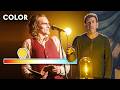 Joker Cinematographer Explains The Impact of Color in Film | Vanity Fair
 Color Contrast Lighting | Advanced Cinematography Techniques
 Filmmaking Tools I Use (and even cheaper alternatives)
![How to Light a Night Scene with Shane Hurlbut ASC [Part 1: Setting Up Your Key Light]](https://i.ytimg.com/vi/wDHoqne58AA/default.jpg) How to Light a Night Scene with Shane Hurlbut ASC [Part 1: Setting Up Your Key Light]
How to Light a Night Scene with Shane Hurlbut ASC [Part 1: Setting Up Your Key Light] JOKER | Hollywood Lighting Techniques
 Cuts & Transitions 101
 Color temperature & White balance: everything you need to know
 CINEMATIC LIGHTING: Understanding Daylight vs Tungsten
 White Balance & Kelvin Color temp explained 💡
![Ultimate Guide to Camera Lenses — Every Type of Camera Lens Explained [Shot List Ep. 7]](https://i.ytimg.com/vi/uSsIqR3DuK8/default.jpg) Ultimate Guide to Camera Lenses — Every Type of Camera Lens Explained [Shot List Ep. 7]
Ultimate Guide to Camera Lenses — Every Type of Camera Lens Explained [Shot List Ep. 7]