Looker Studio Modern Charts Explained – What’s New & How to Use | Looke Studio by Gaille Reports
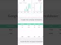
Looker Studio just got a new update — and it includes modern chart styles that can seriously improve your dashboard design. In this video, I’ll show how to use them and when they’re actually helpful.
You’ll learn how to apply the new styles, adjust chart settings, and improve the look of your reports without overcomplicating them.
This update is part of a bigger shift in how Looker Studio handles visualizations — so if you care about clean, useful dashboards, this is worth a look.
In the video:
* What’s new in the latest Looker Studio update
* How to use the new chart styles for better dashboards
* Practical tips on layout, spacing, and dashboard design
If you work with clients or internal teams, these new features can make your dashboards easier to read and more effective.
📢 My new Looker Studio course is launching soon
📥 Subscribe to the blog and get a free Looker Studio template
👍 If this video helped — give it a like and drop your thoughts in the comments
----------------
Video prepared by Gaille Reports - https://gaillereports.com/
Free Looker Studio template - https://gaillereports.com/bonus-for-subscription/
Looker Studio Online Course - https://gaillereports.com/google-looker-studio-online-course/
Blog about Looker Studio and Google Sheets - https://gaillereports.com/blog/
Our Telegram group - https://t.me/gaillereports
Видео Looker Studio Modern Charts Explained – What’s New & How to Use | Looke Studio by Gaille Reports канала Looker Studio dashboards by Gaille Reports
learn google data studio data studio tutorial how in google data studio where in google data studio marketing dashboard automate marketing reports marketing report template how create marketing dashboard sales dashboards example looker studio where in looker studio how to in looker studio google sheets formulas google sheets for marketers advanced google sheets dashboard google analytics 4 google data studio stacked bar chart looker studio update
Комментарии отсутствуют
Информация о видео
7 мая 2025 г. 10:15:03
00:14:08
Другие видео канала