- Популярные видео
- Авто
- Видео-блоги
- ДТП, аварии
- Для маленьких
- Еда, напитки
- Животные
- Закон и право
- Знаменитости
- Игры
- Искусство
- Комедии
- Красота, мода
- Кулинария, рецепты
- Люди
- Мото
- Музыка
- Мультфильмы
- Наука, технологии
- Новости
- Образование
- Политика
- Праздники
- Приколы
- Природа
- Происшествия
- Путешествия
- Развлечения
- Ржач
- Семья
- Сериалы
- Спорт
- Стиль жизни
- ТВ передачи
- Танцы
- Технологии
- Товары
- Ужасы
- Фильмы
- Шоу-бизнес
- Юмор
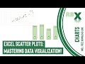
Excel Line Chart With Differences? Do THIS!!
📊 Want to show the difference between two lines in Excel—with arrows and data labels—just like a pro? In this step-by-step tutorial, you'll learn exactly how to create a stunning line chart in Microsoft Excel that visually compares two data series (like 2023 vs. 2024 inflation rates).
We'll cover:
✅ How to build helper columns for average and difference
✅ Adding dynamic arrows between lines
✅ Custom data labels showing exact differences
✅ Smart formatting tips for a clean, professional look
✅ How to hide helper columns without breaking your chart
This chart is perfect for dashboards, reports, and presentations where you want to show not just the trend—but the story behind the numbers.
🎯 Whether you're a beginner or Excel enthusiast, this trick will level up your charting game instantly!
Download link to the excel file used in the video: https://drive.google.com/uc?export=download&id=10o4hYbGXKqWrsjrU9OawkLKIGnP1iyHP
00:00 - Intro
00:50 - Create functions for helper columns
03:02 - Insert the chart
03:36 - Add the helper lines and data labels
07:11 - Add the arrows (error bars)
08:44 - Final formatting
Видео Excel Line Chart With Differences? Do THIS!! канала RBX Excel videos
excel charts excel line chart line chart with difference line chart with differences line chart error bars line chart chart in excel chart with difference differences in excel data labels line chart data labels data label position variance arrow chart arrow chart sales variance in excel dynamic chart in excel excel variance graphs variance charts arrows in charts excel variance line chart dynamic arrows advanced excel charts beautiful chart in excel
Комментарии отсутствуют
Информация о видео
21 июля 2025 г. 16:56:46
00:11:04
Другие видео канала