BEIJING 2018: THE GEELY ICON CONCEPT AND DESIGN
Geely is now well known as the Chinese brand behind Volvo, Polestar, Lynk & Co, Lotus and now a chunk of Daimler. So well known, in fact, that it's almost possible to forget that it is a fair-sized automotive brand in their own right, which has its own design identity, model range, and of course VP of Design, in the shape of Guy Burgoyne.
Guy was kind enough to give us a guided tour of the just-launched Icon concept on the firm’s Beijing show stand, straight after a hectic and swarmingly crowded press conference which just went to prove how much interest Geely can whip up in its home territory.
There’s a photo gallery on the right, and if you go to the bottom of the page, we’ve filmed a 360º video. We spoil you sometimes.
The Icon, as you can probably tell from the pictures, has a distinctly high-tech feel, with what have become the classic technological design signifiers; satin white paintwork with a slight pearl sheen to it, neon blue light accents and a feeling of sleek minimalism inside.
Its SUV format is hardly revolutionary (“some people have said it looks a bit like a Range Rover Evoque,” confessed Guy, “but then there are worse things to be compared to”). We'd guess that the hidden door handles are aiding JLR parallels too. However, there are some clever and well thought-out design details which reveal themselves at a closer look.
“The Icon is an exploration of the Geely brand’s character,” Guy explained. “The ‘expanding universe’ grille pattern and the distinctive DRG with very slim lamps are definitely Geely DNA, but we’ve taken the whole idea and made it a bit more playful.
“The charge displays on the side, the backlit instrument cluster – which disappears completely when the car’s turned off – and the lighting accents give it more of a sense of being a technological object than a traditional car. It’s really designed for the sort of person who interacts heavily with their phone and feels comfortable in that world.”
The ‘licence plates’ are an amusing gadgety touch – they rotate between various displays including a splendidly cheesy ‘I [heart] Beijing’, the name of the car, its outline, a charge indicator and a graphic dog icon. Why a dog? Scroll down and you’ll find out...
“Externally, we tried very hard to make it upright and friendly-looking rather than too aggressive and wedgy. We had to make two or three attempts to get it right, as it was all too easy to overdo the sportiness. But we also tried not to make it too tall; the line of the DLO is incredibly important, particularly with the blacked-out rear pillars. If it gets too high then the car looks daunting.”The interior uses a lot of light grey woven materials, which gives it an airy and modern feel, helped by the floating seats and the chunky silver sills. And if you take a look at our photo gallery, you’ll see that there are some rather neat design elements, like the inner door furniture which subtly mimics the figure-eight motif of the lamps, a motif repeated on the centre console.So will we see this in production? Guy dropped a few fairly hefty hints that it’s more than just a one-off concept, though some of the details almost certainly won’t make it to the factory floor. “Currently there are only eight pieces of glass on the cabin,“ commented Guy, “so that probably wouldn’t be easy to do. And that paintwork – we’ve already had to repaint it once as it’s very prone to marking. The interior’s probably got a few more concept car touches than the exterior, but on the whole it’s not too far off.”
Beijing 2018: Geely Icon concept - Car Design News
Видео BEIJING 2018: THE GEELY ICON CONCEPT AND DESIGN канала GO OTOMOTIF 2
Показать
Комментарии отсутствуют
Информация о видео
Другие видео канала
 Geely Icon concept 360º view
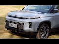 China Geely icon I just drive mobility
 Новый 2019 Geely Icon SUV – Это Вам Не АТЛАС!
 Top 15 Concept SUV's
 Proton Design to be involved in Geely's global projects
 Lại Thêm Tân Binh Xe Trung Quốc Lynk & Co 01 sắp về VN | ĐÁNH GIÁ XE HAY
 Top 10 Electric Cars Will Challenge Tesla in 2018/2019
 Geely's futuristic Concept Icon unveiled at Beijing Auto Show
 THE NEW TOYOTA RAVA4 PRIME, THE PLUG-IN HYBRID VERSION 2021
 Geely Icon — китайский ответ Киа Соулу | Новости с колёс №608
 New 2020 GEELY ICON Boxy Subcompact SUV
 2020 Geely Emgrand Boyue Vs Boyue Pro Walkaround- China Auto Show(2020款吉利博越与博越Pro,外观与内饰对比实拍)
 Серийный паркетник Geely Icon полностью рассекретили
 QUICK LOOK: Geely Concept Icon - new SUV with Volvo XC40 base
 Geely Binyue static evaluation- exterior and interior
 THE NISSAN'S VENUCIA CHINA BRAND REVEALS NEW CONCEPT
 Geely Preface — самый красивый «китаец» | Новости с колёс №225
 New 2020 Geely Icon Release, Specifications,Review, Dates and Prices
 Geely SX-11. Достойный китайский кроссовер
 从概念车到量产 2019体验全新吉利icon