Quick UI using Angular Material Schematics [#2] | Front end development | Web Application
#schematics #material #ui
Source Code: https://github.com/shaheershukur/Market-Web-Application
In this video, we will continue the development of shopping application UI using Angular Material Schematics.
Closed Captioning (CC):
In the previous video, we have done a basic setup of our project.
In this video, we will quickly create the UI using Angular Material Schematics.
Using Material Schematics, we can create different components easily.
Here are they.
Address Form Schematics provides a component with a demo form fields of shipping address.
Navigation Schematics provides a component with a side navigation panel and a toolbar displaying the application name.
Table Schematics provides a component with pre-built material table in it, which supports sorting and pagination.
Dashboard Schematics provides component containing multiple material design cards and menus which are aligned in grid layout.
Tree Schematics provides a component which interactively visualizes a nested folder structure.
Drag and Drop Schematics provides a component for creating interactive to-do list using drag and drop.
For our project, we will use the Navigation Schematics and the Dashboard Schematics.
For that, right click on the project, and select 'Open in Terminal'.
To create the navigation component, type the command 'ng generate @angular/material:navigation' followed by a component name.
We will name the component 'nav'.
On successful creation, we can see the component in the project folder.
The component is created. But it will not be displayed unless we use the component.
We will use the nav component inside the main app components HTML file.
For that, we must know the selector to be used for displaying nav component.
Open the nav components TS file.
Here we can find the selector for this component.
Copy it.
Now, inside the app components HTML file, paste the selector as HTML tags.
Save the file, and let's check the output.
We can see that the browser is now displaying a navigation component.
Also, if we resize the window, we can see the mobile version of the application.
If we open the nav component files, we can see lot of codes automatically added by the Material library.
The HTML file can be split into Side navigation bar, and navigation contents.
We will make some changes in the HTML file.
In the side nav, we will keep two options 'Home' and 'Search'.
Also, we will make some minor changes to the title of our application.
As you can see, here we have a placeholder for adding the main content.
Save the file, and let's see the output.
Based on the navigation item selected by the user, we must display the corresponding component in the main content area.
That is, based on the route selected by user, this area must display the content.
For this purpose, we will be using the 'router-outlet' tag of Angular.
In the nav components HTML file, place the 'router-outlet' tag here.
Let's close all the terminals which are no longer required.
Once the component is created, open the app routing module file.
We will be managing the application routes inside this file.
In the 'routes' array, we can add the routing information.
For the path 'home', we will load the material dashboard component we have created.
Save the file, and let's see the output.
This is the default template provided by the material library.
In our application, 'home' should be displayed on clicking on the side navigation option 'Home'.
For that, open the nav component TS file, and add the attribute 'routerLink' with value we have provided in the routing module file.
That is, '/home'
Let's see the HTML file of 'home' component.
We can modify this as per our requirement.
We will keep only the title in the cards, and remove everything else.
Also, we will rename the page heading to 'Today's Deals'
On observing the code, we can see the gridlist of material library used for displaying the cards dynamically.
Gridlist of material library can be used to display contents in grid based layout.
As a container, we will have 'mat-grid-list'.
Inside this, we can place required number of contents as 'grid-tile'.
Grid list should have attribute 'cols' whose value decides the number of columns grid list will have in total.
Also it can have the attribute 'rowHeight' which decides the height of each row in the grid list.
Here is a grid tile with colspan 3 and rowspan 1.
And this is a grid tile with colspan 1 and rowspan 2.
Also we can see that the cards being displayed are from an array defined in the home components TS file.
Using the breakpoint observer, we will check whether the screen size matches to the size of a handset or not.
And accordingly either of these two arrays will be returned to the HTML.
And in handset mode, we have 2 cards in a row.
For the handset mode, set the 'col' size of all the cards to 2.
As you can see, now we have once card in a row.
This is because, in the material grid list tag in HTML, the column size is set to 2.
Видео Quick UI using Angular Material Schematics [#2] | Front end development | Web Application канала Shaheer Shukur
Показать
Комментарии отсутствуют
Информация о видео
Другие видео канала
 Creating a Single-Sign-On Angular Application | OAuth2 and OIDC
 Theming Angular UI | Light & Dark Mode Switching | Angular Material Theme
 Angular Tutorial for Beginners: Learn Angular & TypeScript
![Interstitial Ads[Part 4] | Admob monetization for Android Apps | Admob tutorial](https://i.ytimg.com/vi/1iKZ9Oji8IU/default.jpg) Interstitial Ads[Part 4] | Admob monetization for Android Apps | Admob tutorial
Interstitial Ads[Part 4] | Admob monetization for Android Apps | Admob tutorial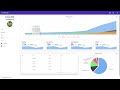 Angular 8 Admin Dashboard Panel from scratch using Angular Material, highcharts and flex-layout 🎉🎉
 Angular Material Data Table Tutorial
 Angular 8 - Flex Layout - Getting started with FxLayout
![Creating a Simple Web Application(Shopping Website) from Scratch [#1] | Angular + Material | Mock-up](https://i.ytimg.com/vi/41aGgttr8UU/default.jpg) Creating a Simple Web Application(Shopping Website) from Scratch [#1] | Angular + Material | Mock-up
Creating a Simple Web Application(Shopping Website) from Scratch [#1] | Angular + Material | Mock-up Learn Angular Material - Full Tutorial
 Angular Material Navbar/Toolbar | Angular Routing
![Integrating Admob[Part 2] | Initial Setup | Admob monetization for Android Apps | Admob tutorial](https://i.ytimg.com/vi/hQEW7yzl3is/default.jpg) Integrating Admob[Part 2] | Initial Setup | Admob monetization for Android Apps | Admob tutorial
Integrating Admob[Part 2] | Initial Setup | Admob monetization for Android Apps | Admob tutorial ngclass and add class in angular (creative developer)
 Angular Material Responsive Navigation Tutorial
 AngularJs UI-Router: Introduction & Getting Started
 Angular 4 QuickStart Tutorial - Angular 4 Directives (ngFor, ngif , ngClass, ngStyle )
 Angular Material Tutorial - 11 - Sidenav
![Stylized custom notification in Angular [#4] | Snackbar component of Material library | Multi-color](https://i.ytimg.com/vi/gO8rL5iXk-Y/default.jpg) Stylized custom notification in Angular [#4] | Snackbar component of Material library | Multi-color
Stylized custom notification in Angular [#4] | Snackbar component of Material library | Multi-color JavaScript Tip: Deleting an Element from an Array
 Angular 4 Tutorial 8: *ngIf and ng-template
 💥 Angular ngClass Core Directive - Learn All Features