- Популярные видео
- Авто
- Видео-блоги
- ДТП, аварии
- Для маленьких
- Еда, напитки
- Животные
- Закон и право
- Знаменитости
- Игры
- Искусство
- Комедии
- Красота, мода
- Кулинария, рецепты
- Люди
- Мото
- Музыка
- Мультфильмы
- Наука, технологии
- Новости
- Образование
- Политика
- Праздники
- Приколы
- Природа
- Происшествия
- Путешествия
- Развлечения
- Ржач
- Семья
- Сериалы
- Спорт
- Стиль жизни
- ТВ передачи
- Танцы
- Технологии
- Товары
- Ужасы
- Фильмы
- Шоу-бизнес
- Юмор
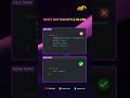
Next-Level CSS Tooltip Animation | Pure CSS Hover Effect #css #webdesign #tooltip #hovereffect
Create an amazing animated tooltip using only CSS 🚀
In this short video, I’ll show you how to build a stylish Instagram-like tooltip with smooth hover effects, layered animation, and modern UI design — no JavaScript needed!
💡 Perfect for:
• UI/UX designers
• Frontend developers
• CSS beginners & advanced learners
.tooltip-container {
position: relative;
cursor: pointer;
transition: all 0.2s;
font-size: 17px;
border-radius: 10px;
}
.tooltip {
position: absolute;
top: 0;
left: 50%;
transform: translateX(-50%);
padding: 10px;
opacity: 0;
pointer-events: none;
transition: all 0.3s;
border-radius: 15px;
box-shadow: inset 5px 5px 5px rgba(0, 0, 0, 0.2),
inset -5px -5px 15px rgba(255, 255, 255, 0.1),
5px 5px 15px rgba(0, 0, 0, 0.3), -5px -5px 15px rgba(255, 255, 255, 0.1);
}
.profile {
background: #2a2b2f;
border-radius: 10px 15px;
padding: 10px;
border: 1px solid #52382f;
}
.icon {
text-decoration: none;
color: #fff;
display: block;
position: relative;
}
.layer {
width: 55px;
height: 55px;
transition: transform 0.3s;
}
.layer span {
position: absolute;
top: 0;
left: 0;
height: 100%;
width: 100%;
border: 1px solid #fff;
border-radius: 15px;
transition: all 0.3s;
}
.layer span,
.text {
color: #e6683c;
border-color: #e6683c;
}
.icon .text {
position: absolute;
left: 50%;
bottom: -5px;
opacity: 0;
font-weight: 500;
transform: translateX(-50%);
transition: bottom 0.3s ease, opacity 0.3s ease;
}
.instagramSVG {
font-size: 25px;
display: flex;
align-items: center;
justify-content: center;
background: -webkit-linear-gradient(45deg,
#f09433 0%,
#e6683c 25%,
#dc2743 50%,
#cc2366 75%,
#bc1888 100%);
background: linear-gradient(45deg,
#f09433 0%,
#e6683c 25%,
#dc2743 50%,
#cc2366 75%,
#bc1888 100%);
filter: progid:DXImageTransform.Microsoft.gradient(startColorstr='#f09433', endColorstr='#bc1888', GradientType=1);
}
.user {
display: flex;
gap: 10px;
}
.img {
width: 50px;
height: 50px;
font-size: 25px;
font-weight: 700;
border: 1px solid #e6683c;
border-radius: 10px;
display: flex;
align-items: center;
justify-content: center;
background: #fff;
}
.name {
font-size: 17px;
font-weight: 700;
color: #e6683c;
}
.details {
display: flex;
flex-direction: column;
gap: 0;
color: #fff;
}
.about {
color: #ccc;
padding-top: 5px;
}
.icon:hover.layer span {
box-shadow: -1px 1px 3px #e6683c;
}
.icon:hover .layer span:nth-child(1) {
opacity: 0.2;
}
.icon:hover .layer span:nth-child(2) {
opacity: 0.4;
transform: translate(5px, -5px);
}
.icon:hover .layer span:nth-child(3) {
opacity: 0.6;
transform: translate(10px, -10px);
}
.icon:hover .layer span:nth-child(4) {
opacity: 0.8;
transform: translate(15px, -15px);
}
.icon:hover .layer span:nth-child(5) {
opacity: 1;
transform: translate(20px, -20px);
}
.tooltip-container:hover .tooltip {
top: -150px;
opacity: 1;
visibility: visible;
pointer-events: auto;
}
.icon:hover .layer {
transform: rotate(-35deg) skew(20deg);
}
.icon:hover .text {
bottom: -35px;
opacity: 1;
}
🚀 Don’t forget to LIKE ❤️, SHARE 🔁 & SUBSCRIBE 🔔 for more awesome CSS tricks!
#css #webdesign #frontend #uiux #tooltip #hovereffect #cssanimation #coding #webdeveloper #shorts
Видео Next-Level CSS Tooltip Animation | Pure CSS Hover Effect #css #webdesign #tooltip #hovereffect канала CSS_WALA
Комментарии отсутствуют
Информация о видео
11 апреля 2026 г. 13:30:12
00:01:08
Другие видео канала
 Color Picker | Master This CSS Trick in Seconds 🚀
 Old vs New CSS Button Reset 🔥 | all: unset vs Traditional Styling #uidesignlearning #frontend
 CSS Image Filled Text Effect 🔥 | Pure CSS Background Clip Text Tutorial
 Advanced CSS Trick: Build Your Own Functions
 Floating Label Input Validation (CSS Only) 🔥 | Mobile Number Input UI Design
 Modern Download Button Animation 🔥 Pure HTML & CSS (No JS) #css #html #webdesign #cssanimation
 Modern Custom 404 Page Design 🔥 | HTML CSS Creative Error Page UI #404page #custom404 #errorpage
 Interactive Hover Card Effect with Pure CSS #hovereffect #carddesign #cssanimation #coding #shorts
 Realistic Debit Card Design in CSS 💳 Front & Back UI Tutorial #cssart #creativecoding #uideveloper
 Responsive Form in CSS 🔥 | Flexbox Trick You Must Know! #csstricks #learncss #coding #uidesign
 CSS + JS Magic: Turn Light ON/OFF 💡 #CSS #JavaScript #WebDevelopment #Frontend #CSSAnimation
 Custom Cursor Using Only CSS 🔥 (No JS) #learncss #coding #webdevelopment #codingtips #csstricks
 Modern Weather App UI 🌤️ CSS Glassmorphism Card #shorts #uidesignlearning #frontendcourse #pro