- Популярные видео
- Авто
- Видео-блоги
- ДТП, аварии
- Для маленьких
- Еда, напитки
- Животные
- Закон и право
- Знаменитости
- Игры
- Искусство
- Комедии
- Красота, мода
- Кулинария, рецепты
- Люди
- Мото
- Музыка
- Мультфильмы
- Наука, технологии
- Новости
- Образование
- Политика
- Праздники
- Приколы
- Природа
- Происшествия
- Путешествия
- Развлечения
- Ржач
- Семья
- Сериалы
- Спорт
- Стиль жизни
- ТВ передачи
- Танцы
- Технологии
- Товары
- Ужасы
- Фильмы
- Шоу-бизнес
- Юмор
Types of button in material 3 using SwiftUI #shorts #short #shortsfeed
There are five types of common buttons: elevated, filled, filled tonal, outlined, and text.
### Takeaways
- Choose the type of button based on the importance of the action. The more important the action is, the more emphasis its button should have.
- All buttons have fully rounded corners
- There are four common color mappings for buttons, each with a light and dark theme.
### **Elevated buttons**
Elevated buttons are essentially filled tonal buttons with a shadow. To prevent shadow creep, only use them when absolutely necessary, such as when the button requires visual separation from a patterned background.
### **Filled buttons**
Filled buttons have the most visual impact after the FAB, and should be used for important, final actions that complete a flow, like Save, Join now, or Confirm.
### **Filled tonal buttons**
A filled tonal button is an alternative middle ground between filled and outlined buttons. They’re useful in contexts where a lower-priority button requires slightly more emphasis than an outline would give, such as "Next" in an onboarding flow. Tonal buttons use the secondary color mapping.
### **Outlined buttons**
Outlined buttons are medium-emphasis buttons. They contain actions that are important, but aren’t the primary action in an app.
### **Text buttons**
Text buttons are used for the lowest priority actions, especially when presenting multiple options.
Видео Types of button in material 3 using SwiftUI #shorts #short #shortsfeed канала kode karim
Комментарии отсутствуют
Информация о видео
1 августа 2022 г. 23:17:24
00:00:17
Другие видео канала
 I repeat, DO NOT TOUCH IT! #coding #swiftui #javascript #swiftui2
 Quick swift tips.
 #short #codingmemes
 #shots #fyp
 Can This Lofi Playlist Skyrocket Your Focus? Find Out Inside! | 45 min
 #shorts #value
 #short #swiftui quick tips, read description for more details
 How well do you relate? 🙃 #python #swiftui #coding #python #swiftui #javascript
 Project management at its peak 💪 #python #swiftcode #coding #swiftui
 #short #meme #shorts , just how amazing ai take his side 🤐
 Guilty as charged 🙌 #coding #swiftui #javascript
 It’s the effort that counts, right? 🙃 #python #coding #python #swiftui #javascript
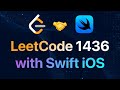 Destination City 1436 | Leetcode | Solved using Swift iOS
 #short #meme
 This you? #coding #swiftui #javascript #swiftui2
 #shorts #swiftuitutorial
 It was a genuine mistake 👉🏻👈🏻 #python #swiftcode #coding #swiftui #javascript
 Even ChatGPT can’t fix my code #python #swiftcode #coding #swiftui #javascript
 #short #swift read description for more details
 #100daysofcodechallenge #shortsvideos #shorts
 Remember, coding is like a marathon, not a sprint. The process may be slow. #shorts