- Популярные видео
- Авто
- Видео-блоги
- ДТП, аварии
- Для маленьких
- Еда, напитки
- Животные
- Закон и право
- Знаменитости
- Игры
- Искусство
- Комедии
- Красота, мода
- Кулинария, рецепты
- Люди
- Мото
- Музыка
- Мультфильмы
- Наука, технологии
- Новости
- Образование
- Политика
- Праздники
- Приколы
- Природа
- Происшествия
- Путешествия
- Развлечения
- Ржач
- Семья
- Сериалы
- Спорт
- Стиль жизни
- ТВ передачи
- Танцы
- Технологии
- Товары
- Ужасы
- Фильмы
- Шоу-бизнес
- Юмор
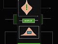
Kernel Density Estimation (KDE) Explained Visually Part-1 | Histogram vs KDE.
#KernelDensityEstimation
#KDE
#Statistics
#DataScience
#MachineLearning
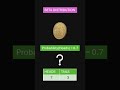
In this video, you’ll learn what KDE is, why it is used, and how it improves upon histograms for understanding data distributions.
We start from raw data points and build the KDE curve step by step, showing how each data point becomes a smooth “kernel” and how adding these kernels creates the final density curve. This video focuses on intuition first, not heavy math.
You’ll also learn:
-What a KDE plot represents
-Why histograms can be misleading
-The difference between histogram and KDE
This video is ideal for:
-Data science beginners
-Statistics students
-Machine learning learners
-Anyone confused by KDE plots
📌 No memorization. Just understanding.
Видео Kernel Density Estimation (KDE) Explained Visually Part-1 | Histogram vs KDE. канала TATHYAM
#KDE
#Statistics
#DataScience
#MachineLearning
In this video, you’ll learn what KDE is, why it is used, and how it improves upon histograms for understanding data distributions.
We start from raw data points and build the KDE curve step by step, showing how each data point becomes a smooth “kernel” and how adding these kernels creates the final density curve. This video focuses on intuition first, not heavy math.
You’ll also learn:
-What a KDE plot represents
-Why histograms can be misleading
-The difference between histogram and KDE
This video is ideal for:
-Data science beginners
-Statistics students
-Machine learning learners
-Anyone confused by KDE plots
📌 No memorization. Just understanding.
Видео Kernel Density Estimation (KDE) Explained Visually Part-1 | Histogram vs KDE. канала TATHYAM
Комментарии отсутствуют
Информация о видео
6 февраля 2026 г. 12:30:31
00:06:27
Другие видео канала