Hierarchy of Marks
Today I'm going to talk about the Hierarchy of Marks, that is the order in which our mind and eye notices contrast on the canvas🎨
Our eye reads different kinds of contrast in the following order:
1. Value🥇
2. Colour🥈
3. Pattern🥉
4. Texture
The higher the type of contrast is on the hierarchy of marks, the more it will attract our eye. For instance, a contrast of value in our painting will attract the eye more than a contrast of texture.
By understanding the Hierarchy of Marks you can more accurately define your center of interest, and create pathways to lead the viewer around your painting😊 👍
Видео Hierarchy of Marks канала Tim Packer Fine Arts
Показать
Комментарии отсутствуют
Информация о видео
Другие видео канала
 A Painting in One Day - Daily Art Vlog - Episode 041
 Its Been A Busy Few Weeks! Tim Packer Art Vlog - Episode 095
 Tim Packer Daily Art Vlog - Episode 003
 Do You Have Trouble Starting a Painting or Bringing It To Finish? - Daily Art Vlog - Episode 083
 Are You Interested In Creating and Selling Your Courses Online?
 The Difference between Postmoderism and Commercial Sales
 How to find a Mentor #artmentorship #artisticprocess #artist #painter
 Setting Goals for the New Year - Tim Packer Mentorship Program with Brooke Cormier: Episode 6
 Painting in Process Mode
 Gol slideshow HD 1080p
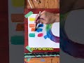 Complementary Colours
 Are You Too Romantic About Your Art? -Daily Art Vlog - Episode 046
 Walk in the Woods, Lynde Marsh Timelapse
 E-Mail Scams Targeting Artists - Daily Art Vlog - Episode 47
 Tim Packer Pop-Up Gallery - Daily Art Vlog - Episode 088
 Killarney Morning Time Lapse part 02 - Vlog 097
 Back in The Studio - Tim Packer Daily Art Vlog 014
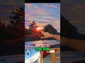 Center of Interest
 Understanding The 3 Modes of Creating
 My Latest Timelapse - Daily Art Vlog - Episode 025
 Taking on Commissions - Art Vlog - Episode 094