- Популярные видео
- Авто
- Видео-блоги
- ДТП, аварии
- Для маленьких
- Еда, напитки
- Животные
- Закон и право
- Знаменитости
- Игры
- Искусство
- Комедии
- Красота, мода
- Кулинария, рецепты
- Люди
- Мото
- Музыка
- Мультфильмы
- Наука, технологии
- Новости
- Образование
- Политика
- Праздники
- Приколы
- Природа
- Происшествия
- Путешествия
- Развлечения
- Ржач
- Семья
- Сериалы
- Спорт
- Стиль жизни
- ТВ передачи
- Танцы
- Технологии
- Товары
- Ужасы
- Фильмы
- Шоу-бизнес
- Юмор
CSS text-shadow Property Explained
The text-shadow property is used to add shadow effects to text, enhancing visual hierarchy. It is commonly applied to headings, buttons, logos, and other text elements that need to stand out.
Basic Syntax:
text-shadow: [horizontal-offset] [vertical-offset] [blur-radius] [color];
Horizontal offset (required): Shadow's horizontal position (positive values move right, negative values move left).
Vertical offset (required): Shadow's vertical position (positive values move down, negative values move up).
Blur radius (optional): Shadow blur intensity (higher values create softer shadows; default is 0).
Color (optional): Shadow color (defaults to the text color).
Видео CSS text-shadow Property Explained канала ZBU
Комментарии отсутствуют
Информация о видео
11 апреля 2025 г. 16:36:31
00:00:18
Другие видео канала
 CSS RBG color
 The align-content property in Flexbox
 Data compression
 The grid-column-start property in grid layout
 CSS unset Keyword - Complete Guide
 Containing Block for Static-Positioned Elements
 CSS clear floats
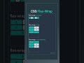 the flex-wrap Property in Flexbox
 html tag list
 CSS inherit Keyword Explained
 JavaScript statement
 Using CSS BFC to Solve Parent Element Height Collapse
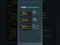 HTML list elements
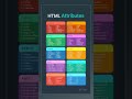 html attributes
 CSS Flexbox basic
 HTML basic layout
 The flex-order Property in Flexbox
 CSS Selector Specificity Tower
 Containing Block for Inline Static-Positioned Elements
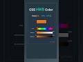 CSS HWB color