The Best Logos Ever Designed Are Simple Not Interesting & Not Overworked
Why Designers Should Strive To Make Designs Simpler vs. More "Interesting". Make your logo simpler, more legible and timeless vs. trying to be clever. The best logos in the world are often the simplest: Nike, Apple, Google, B&O, Levi's, FedEx, CBS, UPS, Warner, Girl Scouts, ABC, United Airlines, American Airlines, and IBM to name a few. They often use very common typefaces like Helvetica or Futura and refrain from over embellishment. Still don't believe us? Look at some of the most expensive luxury brands and study their logo.
In his newest book, Blair Enns talks about the value of logo design isn't based on hours worked, or even the perceived quality of the design. To illustrate the point, he states, the Nike logo was designed for $100 while the Pepsi logo was $1 million. Is the million dollar logo better than the $100 logo? Is it worth 100,000 times more?
Designers often mistake the effort or cleverness of a logo as the hallmark of value. It is not. Furthermore, Michael Bierut says too much is made of a logo. A logo is only a very small aspect of the brand. It's not the whole story just the opening paragraph of a long story.
Jijibaba logo designed by Astrid Starvo, Atlas
http://www.astridstavro.com
This is the Futur of Education— Disrupting the design education paradigm.
Want a deeper dive? Typography, Lettering, Sales & Marketing, Social Media and The Business of Design courses available here:
https://goo.gl/bRt5qd
—
Love the content? Become a sustaining member for $5/mo today.
https://goo.gl/uKcJ3N
BOOKLIST –
Essential Reading for Creative Professionals: https://bit.ly/biz-booklist
Essential Design Books: https://bit.ly/futur-design-books
Kits & Proposals:
https://goo.gl/mSjuWQ
Visit our website:
https://www.thefutur.com
FREE resources:
https://goo.gl/Qh6gHr
—
OUR AFFILIATE LINKS*
Skillshare: https://goo.gl/YCo2uT
Amazon: https://goo.gl/K1bIhg
Creative Market: https://goo.gl/g4jlTE
—
Futur Podcast on iTunes: 🎙
https://itunes.apple.com/us/podcast/the-futur/id1209219220?mt=2
—
Connect with us online:
https://www.facebook.com/theFuturisHere/
https://twitter.com/thefuturishere
https://www.instagram.com/thefuturishere/
—
Credits:
Executive Producer– Chris Do
Host– Chris Do
Director– Erica Pead
Cinematography– Aaron Szekely, Mark Contreras
Editor– Stewart Schuster, Erica Pead
Futur Theme Music – Adam Sanborne http://www.adamsanborne.com
Annotations– Isaiah Nwukor
Typefaces: Futura, Din, Helvetica Neue
Futur theme song— Adam Sanborne
===
*By making a purchase through any of our affiliate links, we receive a very small commission at no extra cost to you. This helps us on our mission to provide quality education to you. Thank you.
Видео The Best Logos Ever Designed Are Simple Not Interesting & Not Overworked канала The Futur
Показать
Комментарии отсутствуют
Информация о видео
Другие видео канала
 I Wish I Knew This When I Started: Logo Design
 3 Principles to Improve Your Logo Design Process - Legibility, Hierarchy, and Contrast
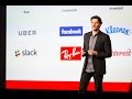 How to create a great brand name | Jonathan Bell
 F1 Formula 1 Logo Review Critique
 ✏️ How To Design A Modern Logo | Start To Finish
 I Paid 5 Designers On Fiverr To Design The SAME Logo... 🧐
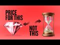 Pricing Design Work & Creativity
 Reinvent Yourself (2021)– Obstacles Are Opportunities In Disguise
 Chris Do Redesigns Our Logo! (For FREE)
 16 FAMOUS LOGOS WITH A HIDDEN MEANING (That We Never Even Noticed)
 🔴 What Makes A Logo Great & Iconic? w/ Sagi Haviv
 Logo Design Trends in 2020 | Top 10 Logo Design Trends | Adobe Creative Cloud
 The Worst Mistake In logo Design ⁉️
 What Is Branding? 4 Minute Crash Course.
 How To Balance a LOGO
 Stories Behind Iconic Logos (McDonald's, Apple, Nike, FedEx) | Skillshare Questions
 The 3 Rules of Good Logo Design
 How to Create an Iconic Logo
 3 Tips to Improve Your Logo Design - Critiquing, Simplifying, Research