Best Part Of The MACD Indicator Trading - Forex Day Trading
The Best Part of the MACD Indicator Trading Strategy that can make you More Money in Stock Market and Forex Trading as a Day Trader and Swing Trader.
Official Trading Rush Website: https://tradingrush.net
Download Official Trading Rush APP (Thanks): https://bit.ly/tradingrushapp
Support the Channel on Patreon (Thanks): https://www.patreon.com/tradingrush
Trading Merch for Best Traders: https://teespring.com/stores/trading-rush
Watch More Videos:
MACD Trading Strategy tested 100 times : https://youtu.be/nmffSjdZbWQ
Trading Strategies Tested 100 Times : https://www.youtube.com/playlist?list=PLuBdu9GKAoP4shAZd6QnM5BJUy1-IcnyD
Trading Strategies : https://www.youtube.com/playlist?list=PLuBdu9GKAoP6MEtX7stfzTGx62M5r3F4Z
Trading Tips and Mistakes : https://www.youtube.com/playlist?list=PLuBdu9GKAoP6lPl2txSXE8AlkhiwgWU2O
Download Excel Sheet for Day Trading : https://youtu.be/fLKd7uKZOvA
Subscribe For More Videos.
Why the MACD indicator is so popular? I have already made a video on the best MACD strategy, but in that video, I never talk about why MACD is one of the most useful Indicator out there. This video is not about the MACD strategy. In this video, you will learn, how MACD can improve your existing trading strategy, by giving you some really useful information.
Do you find yourself taking trades at the end of the trends? Then this video is for you.
Lets say, when you open a chart of a stock or forex pair, you see this.
Bunch of big red candles in a row. Is this a down trend? If yes, where should you enter your position? Should you enter now?
Well, if you enter now, how do you know the price is not going to reverse as soon as you enter the trade? How do you know if the strength of the trend is still strong or weak?
What If I told you, there is an easy way to identify the strength of the trend?
In the MACD video, I talk about how the crossover of the MACD lines can be used as an entry signal generator. In this video, lets talk about the histogram, and how it can be really useful to analyse the chart better.
Before, we couldn't tell if the trend was weakening or not. But If we add MACD to this chart, we can see that the MACD is indicating a weakness in the down trend. If you had entered a short position right here, you would have lost because the price went up. Furthermore, the MACD crossover also gave a long entry signal.
But how do these histogram bars show the strength of a trend?
Well, to answer that question, we will have to understand how the MACD indicator actually works.
If you plot the MACD indicator on a chart, it will come with default input settings of 12, 26 and 9.
In simple words, what MACD really does is, compare the average of last 12 candles, with the average of last 26 candles. When it will compare these two averages, it will get a value that will indicate, whether the average of last 12 candles is weak or strong when compared to the last 26 candles.
If that sounds confusing, Lets take a look at another example. Lets say, there is a cat on a ladder. On the first day, the cat climbs 10 steps. On the second day, the cat climbs 40 more steps. On the third day, 20 more steps. On the Fourth day, 10 more. And only 5 more step on the fifth day.
Now, anyone can tell that the cat is climbing upwards. But if you look closely, you can tell that the cat is losing its strength day by day. The cat is getting tired. And finally decides to climb back down.
If you plot the strength of the cat using a histogram. You will see it looks very similar to that of a stock or a Forex pair. In our cat example, you can see how the strength of the cat is decreasing day by day.
MACD's histogram shows a similar thing. On this chart, one would have said, that this is a strong downtrend. But if we add the MACD indicator, we can see that, although it is a down trend, the strength of the downtrend is getting weaker. If it is getting weaker, there is a chance that the trend could reverse, or give a pullback.
And as you saw earlier, the trend did reverse, and started an uptrend.
Now remember what I said earlier. This is not an entry signal strategy. You cannot trade using the MACD histogram alone. It is better to use it to analyse the strength of the trend, and you can also use it to improve your existing Trading strategy.
Let me give you an example.
Lets say, you found a support area. You are calmly waiting for the price to reach your support area. But then few big red candles show up. These red candles can indicate a possibility of a new down trend.
Instead of getting paranoid, you simply look at the histogram of the MACD indicator. When the price comes near your support area, you see that strength of the downtrend is getting weaker. This is a good sign, as it can indicate a possible buying pressure at or near your support levels.
Once you see the weakness in the downtrend, you simply wait for a proper long entry signal, Like a candlestick pattern, and enter the trade.
Видео Best Part Of The MACD Indicator Trading - Forex Day Trading канала TRADING RUSH
Показать
Комментарии отсутствуют
Информация о видео
Другие видео канала
 5 MACD Strategy MISTAKES you should avoid in Trading Forex Stocks... or... - Forex Day Trading
 Best RSI Indicator Trading Strategy - Wysetrade Method
 One Of The BEST Beginner Trading Indicators (THE MACD INDICATOR!)
 I risked MACD Trading Strategy 100 TIMES Here’s What Happened... - Forex Day Trading
 3 BEST Time Frames for Intraday Trading Strategies you should know - Day Trading - Forex Day Trading
 Trading MACD Histogram
 Live Trading Forex Strategy EVER!!! Made +175 $ in 4 MINUTES on Intraday Trade
 How I got 70% Win Rate in Trading with this... Trading Strategy - Forex Day Trading
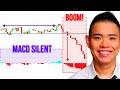 MACD Indicator Secrets: 3 Powerful Strategies to Profit in Bull & Bear Markets
 4 USEFUL Trading Breakout Tips that can Make You MONEY in TRADING - Forex Day Trading
 🔴 "MACD Double Divergence" The Ultimate MACD Patterns Trading Course
 5 Simple Steps Complete Trading Strategy that PRO Traders Know but Beginners Ignore...
 Master The ATR Indicator (Most Useful Indicator On The PLANET!)
 Highly Profitable Stochastic + RSI + MACD Trading Strategy (Proven 100x)
 MACD Indicator (It's Not Great, BUT....)
 I tested FASTER MACD 100 TIMES and it was... Zero Lag MACD Trading Strategy - Forex Day Trading
 How to Grow a Small Trading Account FAST - Day Trading !!
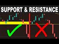 How to draw Support and Resistance like a PRO - Forex Day Trading
 Best VWAP Indicator Trading Strategy EVER!!! How to use VWAP Indicator Intraday Trading Strategy