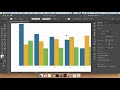
How to make grouped bar charts in pandas/Python with crosstab and pivot tables and more
Building grouped bar charts in pandas can be a pain, since you need to understand how .plot() and matplotlib work *AND* get your data formatted correctly first. This video explains how .plot() works, what columns/rows do when plotting, and how to reshape or reorganize your data into a grouped-bar-chart-friendly format - we look at pivot_table, groupby + value_counts + reset_index or unstack, and crosstab. Not in-depth, but probably enough to tackle what you're trying to do!
Completed code: https://gist.github.com/jsoma/4654e706a8af61d71b7055304824fa50
Other recommended graphing libraries:
Altair: https://altair-viz.github.io/
Seaborn: https://seaborn.pydata.org/index.html
If you're asking yourself "why are there so many bold words for index names or columns??" or "why did he have to do y='count' in that one spot???" I recommended giving a read about MultiIndexes: https://pandas.pydata.org/pandas-docs/stable/user_guide/advanced.html
Видео How to make grouped bar charts in pandas/Python with crosstab and pivot tables and more канала Jonathan Soma
Показать
Комментарии отсутствуют
Информация о видео
28 июня 2021 г. 20:03:08
00:19:17
Другие видео канала
 How to use Adobe Illustrator to clean up data visualizations
 Data Analysis with Pandas: StockX Sneaker Sales (datetimes, resample, groupby)
 Host a website on GitHub Pages without using git
 What is disease modeling? Intro to the SIR model.
 Easy Data-Driven Bubble Maps in Adobe Illustrator
 ai2html text overflow and other annotation/label issues: an easy fix
 D3 Class Review 1: Introduction to SVG
 Scraping to a pandas CSV using BeautifulSoup and Python
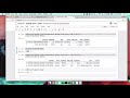 Spatial Joins in geopandas, part 2
 D3 Class Review 6: Start-to-finish data-driven D3 visualization
 Spatial joins in geopandas
 D3 Class Review 4: Adding elements in D3 with the enter/append pattern
 How to disable a workflow on GitHub Actions
 Customize website with bulma CSS framework: easy design tutorial with no CSS and no templates!
 D3 Class Review 3: Binding data to visual elements
 Scrollytelling with ai2html and scrollama.js
 Responsive Data Visualizations in Illustrator with ai2html
 D3 Class Review 5: Running a server for D3 visualizations
 Sawhorse complete walkthrough: Building ai2html and d3 sites using sawhorse
 Transcription and audio models (Practical AI for Investigative Journalism, Session 6)
 Introduction to GeoDataframes in geopandas