Normalising Data for plotting graphs in Excel
This short tutorial shows how to normalise grouped data in Excel for the production of graphs showing change in outcome over time where the baseline may be variable but the change in outcome consistent.
© 2015 James Clark
Видео Normalising Data for plotting graphs in Excel канала Dory Video
© 2015 James Clark
Видео Normalising Data for plotting graphs in Excel канала Dory Video
Показать
Комментарии отсутствуют
Информация о видео
Другие видео канала
 How To: Normalize and Standardize Data in Excel
 Standardization Vs Normalization- Feature Scaling
 Normalising grouped data in Excel
 How to normalize data in origin
 Basic Concept of Database Normalization - Simple Explanation for Beginners
 Excel - Normalizing & Averaging Large Data
 Normalized Data with microsoft excel
 Regression for Managers 4.2: Control Variables and Dummy Variables
 Normalizing data: The what, why and how
 Data Normalization
 Graphing two data sets on the same graph with Excel
 How to graph Multiple lines in 1 Excel plot | Excel in 3 Minutes
 Bookkeeping for Small Business - Excel Tutorial - Part 1 - Invoice Tracking - Bookkeeping Training
 graphing spectra
 MATLAB Tools for Scientists: Introduction to Statistical Analysis
 How to use Microsoft Excel for ETL, Data Modelling and Analytics - Full Tutorial under 30 minutes!
 Tutorial XRF data calculations
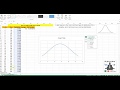 How to Create Bell Curve in Excel
 MS Excel - Pivot Table Example 1 Video Tutorials