- Популярные видео
- Авто
- Видео-блоги
- ДТП, аварии
- Для маленьких
- Еда, напитки
- Животные
- Закон и право
- Знаменитости
- Игры
- Искусство
- Комедии
- Красота, мода
- Кулинария, рецепты
- Люди
- Мото
- Музыка
- Мультфильмы
- Наука, технологии
- Новости
- Образование
- Политика
- Праздники
- Приколы
- Природа
- Происшествия
- Путешествия
- Развлечения
- Ржач
- Семья
- Сериалы
- Спорт
- Стиль жизни
- ТВ передачи
- Танцы
- Технологии
- Товары
- Ужасы
- Фильмы
- Шоу-бизнес
- Юмор
Manager Comparison Dashboard That Actually Works #excel #tutorial
https://www.other-levels.com
🌍 🏅 The #1 Website Worldwide for Excel Dashboard Templates, Reports, and Professional Analysis Tools.
🎖️ 🏆 Other Levels YouTube Channel — The #1 Authority for Excel Dashboards on YouTube, with over 24 million views and a global impact.
💼 Other Levels Services
* Custom Excel Dashboard Service https://other-levels.com/products/custom-excel-dashboard-service
* Enhance Your Templates Service https://other-levels.com/products/enhance-your-templates-service
🎓 Master Excel Dashboards
Join over 100,000 learners in our top-rated online course and gain the skills to create professional Excel dashboards from scratch.
👉 Enroll today: https://other-levels.com/products/master-microsoft-excel-dashboards-online-course
To watch the full Tutorials? Join our channel Membership https://www.youtube.com/channel/UCuDF09RGFE3V3lY77Z_cA9g/join
🎓 Free Excel Courses On YouTube:
Single Dynamic Excel Dashboard https://www.youtube.com/playlist?list=PLxuBYEpUjhDsVA2O1FTayFiYrDfoErdbx
Multiple Dynamic Excel Dashboards https://www.youtube.com/playlist?list=PLxuBYEpUjhDuAfwWMEgnYirso6UXMzPB9
Have a question about this template?
👇🏻Comment down below
Let’s connect on social
LinkedIn https://www.linkedin.com/company/other-levels-com
Facebook https://www.facebook.com/Other.levels.Official
Instagram https://www.instagram.com/other.levels
TikTok https://www.tiktok.com/@other.levels
Playlists
Data Analysis By Power Point https://youtube.com/watch
PowerPoint Slides https://youtube.com/watch
CV/Resume Templates https://youtube.com/watch
Organizational Structure Chart https://www.youtube.com/watch
PowerPoint Templates https://youtube.com/watch
PowerPoint Dashboard https://youtube.com/watch
Modern Excel Reports https://youtube.com/watch
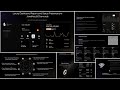
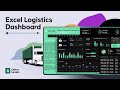
⭐️ Forecast Commit Dashboard – Performance Tracking for Weekly Reviews
This Excel Dashboard is designed for teams who need a clear, structured view of forecast accuracy and commit discipline. It brings together weekly pacing, account-level insights, and month-end scenarios in one organized interface, helping leaders understand performance without digging through raw sheets. The goal is simple: give decision-makers a practical tool to monitor momentum and react early.
High-Level KPI Overview
The dashboard includes TCV and ACV views, providing a balanced picture of total contract value and profit gross profit expectations. These KPI cards highlight targets, achievement rates, and GAP values, allowing users to spot pacing risks before they escalate. The layout uses soft highlights and occasional neon orange notes to pull attention toward critical movements. Teams who need people-related analytics can explore our Employee Performance Analysis Dashboard Report for HR-focused insights.
Weekly Trend Analysis
Two line graph charts track weekly changes. A line graph is useful for showing trends over time, so users immediately see trajectory meaning without complicated interpretation. These trends help teams understand whether their performance trajectory definition is improving, flattening, or slowing compared to the weekly plan. Managers can also add a trend line to Excel chart areas if they want deeper pattern recognition.
Forecast Exit & Judge Scenarios
Forecast Exit visuals show potential month-end landing positions. Each scenario estimates the expected finish based on recent pacing, providing a practical read on risk or acceleration. This supports fast decision-making in environments where commit stability is essential. Although inspired by forecasting models, the dashboard remains simple enough for everyday use.
Manager & Account Performance
The comparison table displays best case, commit, closed, and pipeline values for each manager. Subtle formatting makes it easy to compare acv vs tcv performance.
Pipeline Strength & Key Deals
Pipeline charts offer insight into conversion potential and pipeline coverage ratio.
#excel #dashboard #design
Видео Manager Comparison Dashboard That Actually Works #excel #tutorial канала Other Level’s
🌍 🏅 The #1 Website Worldwide for Excel Dashboard Templates, Reports, and Professional Analysis Tools.
🎖️ 🏆 Other Levels YouTube Channel — The #1 Authority for Excel Dashboards on YouTube, with over 24 million views and a global impact.
💼 Other Levels Services
* Custom Excel Dashboard Service https://other-levels.com/products/custom-excel-dashboard-service
* Enhance Your Templates Service https://other-levels.com/products/enhance-your-templates-service
🎓 Master Excel Dashboards
Join over 100,000 learners in our top-rated online course and gain the skills to create professional Excel dashboards from scratch.
👉 Enroll today: https://other-levels.com/products/master-microsoft-excel-dashboards-online-course
To watch the full Tutorials? Join our channel Membership https://www.youtube.com/channel/UCuDF09RGFE3V3lY77Z_cA9g/join
🎓 Free Excel Courses On YouTube:
Single Dynamic Excel Dashboard https://www.youtube.com/playlist?list=PLxuBYEpUjhDsVA2O1FTayFiYrDfoErdbx
Multiple Dynamic Excel Dashboards https://www.youtube.com/playlist?list=PLxuBYEpUjhDuAfwWMEgnYirso6UXMzPB9
Have a question about this template?
👇🏻Comment down below
Let’s connect on social
LinkedIn https://www.linkedin.com/company/other-levels-com
Facebook https://www.facebook.com/Other.levels.Official
Instagram https://www.instagram.com/other.levels
TikTok https://www.tiktok.com/@other.levels
Playlists
Data Analysis By Power Point https://youtube.com/watch
PowerPoint Slides https://youtube.com/watch
CV/Resume Templates https://youtube.com/watch
Organizational Structure Chart https://www.youtube.com/watch
PowerPoint Templates https://youtube.com/watch
PowerPoint Dashboard https://youtube.com/watch
Modern Excel Reports https://youtube.com/watch
⭐️ Forecast Commit Dashboard – Performance Tracking for Weekly Reviews
This Excel Dashboard is designed for teams who need a clear, structured view of forecast accuracy and commit discipline. It brings together weekly pacing, account-level insights, and month-end scenarios in one organized interface, helping leaders understand performance without digging through raw sheets. The goal is simple: give decision-makers a practical tool to monitor momentum and react early.
High-Level KPI Overview
The dashboard includes TCV and ACV views, providing a balanced picture of total contract value and profit gross profit expectations. These KPI cards highlight targets, achievement rates, and GAP values, allowing users to spot pacing risks before they escalate. The layout uses soft highlights and occasional neon orange notes to pull attention toward critical movements. Teams who need people-related analytics can explore our Employee Performance Analysis Dashboard Report for HR-focused insights.
Weekly Trend Analysis
Two line graph charts track weekly changes. A line graph is useful for showing trends over time, so users immediately see trajectory meaning without complicated interpretation. These trends help teams understand whether their performance trajectory definition is improving, flattening, or slowing compared to the weekly plan. Managers can also add a trend line to Excel chart areas if they want deeper pattern recognition.
Forecast Exit & Judge Scenarios
Forecast Exit visuals show potential month-end landing positions. Each scenario estimates the expected finish based on recent pacing, providing a practical read on risk or acceleration. This supports fast decision-making in environments where commit stability is essential. Although inspired by forecasting models, the dashboard remains simple enough for everyday use.
Manager & Account Performance
The comparison table displays best case, commit, closed, and pipeline values for each manager. Subtle formatting makes it easy to compare acv vs tcv performance.
Pipeline Strength & Key Deals
Pipeline charts offer insight into conversion potential and pipeline coverage ratio.
#excel #dashboard #design
Видео Manager Comparison Dashboard That Actually Works #excel #tutorial канала Other Level’s
ACV Dashboard in Excel Profits TCV Trajectory advanced excel analysis commit dashboard excel dashboard in excel dashboard metrics dashboards excel data visualization dynamic templates excel automation excel dashboard excel metrics excel solutions excel template financial forecasting forecast forecast modeling kpi metrics dashboard other levels other-levels.com performance analysis performance metrics performance tracking template design template sheets
Комментарии отсутствуют
Информация о видео
10 января 2026 г. 21:00:37
00:00:43
Другие видео канала