Create a Stacked Column or Bar Chart
Column charts provide a quick way to compare data. A variant of the column chart is a stacked column chart which visually shows how different parts of the total stack up to each other. Think of it as a pie chart, but in a horizontal column or bar format. See this video to learn how to create a stacked column, 100% stacked column or stacked bar chart.
🔔 SUBSCRIBE to my channel ➜ https://goo.gl/wN3c3p
🏫 Excel Training ➜ https://www.exceltraining101.com/p/training.html
📚 Excel Books & Tech Gear ➜ https://www.amazon.com/shop/dough
⚙️ Tools: Screencasting ➜ https://techsmith.z6rjha.net/5Qe53
⚙️ Tools: Microsoft Office ➜ https://microsoft.msafflnk.net/rKL0G
⚙️ Tools: TubeBuddy ➜ https://www.tubebuddy.com/et101
📝 This description may contain affiliate links and we'll receive a small commission if a purchased is made using the links (but at no additional cost to you). It'll support the channel and so more videos like this can be made. Thanks for your support!
🎁 If you find these videos useful and want to support my channel go to https://www.buymeacoffee.com/dough
#excel
#msexcel
#doughexcel
-~-~~-~~~-~~-~-
Please watch: "Convert Table in a PDF File to Excel"
https://www.youtube.com/watch?v=COUOvhbQ4CQ
-~-~~-~~~-~~-~-
Видео Create a Stacked Column or Bar Chart канала Doug H
Показать
Комментарии отсутствуют
Информация о видео
Другие видео канала
 Pivot One Column Address - Excel #Shorts
 Create an Org Chart in Visio Using Manual Steps
 Create a Dynamic Calendar Table
 Use PowerQuery to Change the Order of Cell Values or Text
 Perform Basic Correlation Analysis in Excel
 Unveiling the Hidden Power of the TEXT Function for Currency Conversion
 How to Copy Formatting from Cells or Charts in Excel: A Step-by-Step Guide
![Create a Moving Average [2 Examples]](https://i.ytimg.com/vi/IScTBtGzav0/default.jpg) Create a Moving Average [2 Examples]
Create a Moving Average [2 Examples] Use a Picture in a Chart
 Perform a One Sample Proportion Test in Excel
 Use the Excel Geography Data Type & Filled Map Feature
 Sort Columns or Rows
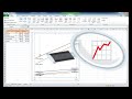 Create a Slopegraph
 Keyword Lookup with Power Query
 Separate Username from Email - Excel #Shorts
 Use the Forecast Sheet in Excel
 Create Video Inside Text or a Track Matte Effect
 Dependent Drop Down List Dynamic Array in Excel
 Excel Secrets: Remove Duplicates in Seconds - Excel #Shorts
 Finding Duplicate Values - Google Sheets
 Extract Hyperlinks from Sentences in a Column