- Популярные видео
- Авто
- Видео-блоги
- ДТП, аварии
- Для маленьких
- Еда, напитки
- Животные
- Закон и право
- Знаменитости
- Игры
- Искусство
- Комедии
- Красота, мода
- Кулинария, рецепты
- Люди
- Мото
- Музыка
- Мультфильмы
- Наука, технологии
- Новости
- Образование
- Политика
- Праздники
- Приколы
- Природа
- Происшествия
- Путешествия
- Развлечения
- Ржач
- Семья
- Сериалы
- Спорт
- Стиль жизни
- ТВ передачи
- Танцы
- Технологии
- Товары
- Ужасы
- Фильмы
- Шоу-бизнес
- Юмор
Build a Responsive Navbar with Shopping Cart Icon in React+Tailwind |Mobile Hamburger Menu Tutorial
In this video, you'll learn how to create a fully responsive navbar using React and Tailwind CSS. We'll build a modern navigation bar with a hamburger menu for mobile devices, a shopping cart icon, and a stylish sign-in button. This is a beginner-friendly step-by-step tutorial that's perfect for your next web project!
🔧 Technologies Used:
• React JS
• Tailwind CSS
• React Icons
📚 What You’ll Learn:
• Responsive navbar layout
• Mobile hamburger menu toggle
• Styling with Tailwind utility classes
• Adding icons (cart, menu, close)
• Conditional rendering with useState
💻 Source Code:
https://github.com/LuneLand/Navbaaar
📺 Watch next:
• Build a React Portfolio Website:
• Responsive Landing Page with Tailwind CSS: https://youtu.be/your-link
🔔 Subscribe for more tutorials on React & Tailwind!
chapters:
00:00 Intro
00:22 Setup React And Tailwind
02:52 Navbar
06:31 Hamburger Menu
10:36 Outro
#reactjs #tailwindcss #responsivenavbar
#HamburgerMenu #ReactNavbar #reactcomponents #reacthooks #webdevelopment #frontenddevelopment #reacttutorial #tailwindtutorial #reacttailwind #MobileNavbar #uiuxdesign #javascript #codingforbeginners #learnreact #webdesign#reactprojects#TailwindProjects#programmingtutorial #developertools #modernwebdesign #htmlcssjs #responsivedesign
Видео Build a Responsive Navbar with Shopping Cart Icon in React+Tailwind |Mobile Hamburger Menu Tutorial канала Lune Land
React Tailwind CSS Responsive Navbar Hamburger Menu React Tutorial Tailwind Tutorial Frontend Development Web Design React Project React Navbar mobile navbar react react navbar with icons react navigation bar react ui design tailwind css tutorial react responsive menu navbar toggle react frontend tutorial react for beginners tailwind css for beginners
Комментарии отсутствуют
Информация о видео
1 июня 2025 г. 4:35:00
00:11:04
Другие видео канала
 Adding a Contact Section to Your Portfolio Website with React & Tailwind! 📩✨ #coding #tailwind#react
 Restaurant Design Tutorial with React js and Tailwind CSS #webdesign #webdevelopment
 Build a Professional Portfolio Website with React & Tailwind CSS | Full Responsive Project 🌐💻✨
 Build an Image Slider with React & Tailwind CSS 🚀 Full Tutorial
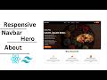
 Add Dark Mode to Your React Website with Tailwind CSS v4 🌙⚡ |Responsive Navbar & Hero Section
 Broken Image in React? Show a Fallback with Tailwind & Motion!
 Build a Modern & Fully Responsive Spices Website in React | Clean Tailwind CSS UI/UX Design
 Build a React Image Slider Step-by-Step (Easy Tutorial with Tailwind + Vite)
 How to Build a Coffee Shop Website with React and Tailwind | Menu, Contact, and Responsive Design ☕🍰
 Build Responsive Projects, Contact & Footer Sections in React + Tailwind | Step-by-Step Guide 🧑💻📬
 Customer Reviews Section Design with React & Tailwind CSS | Build Responsive UI #coding #webdesign
 Build a Stunning Fruit Shop Website with React and Tailwind CSS | Modern & Responsive 🍎💻
 Build a Beauty Website with React, Tailwind CSS & Framer Motion | Responsive & Animated Design
 Stunning Fruit Shop Animation with React and Tailwind CSS 🍎✨#frontenddevelopment #coding #react
 Stunning Spice Shop Website with Vite & Tailwind CSS | Navbar, Hero & About
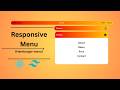 🔥 Create a Stunning Responsive Navbar with Tailwind CSS & React | Smooth Hamburger Menu
 Build Teachers, Pricing & Footer Sections | Modern React + Tailwind Project
 How to Build a Modern Travel Website? | React + Tailwind CSS Tutorial
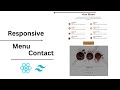 Design a Stylish Coffee Shop Menu & Contact Page | React + Tailwind CSS Full Tutorial 2025 ☕📋📞
 Create a responsive hamburger menu with Tailwind CSS! 🍔✨ #coding #frontenddevelopment #tailwindcss