- Популярные видео
- Авто
- Видео-блоги
- ДТП, аварии
- Для маленьких
- Еда, напитки
- Животные
- Закон и право
- Знаменитости
- Игры
- Искусство
- Комедии
- Красота, мода
- Кулинария, рецепты
- Люди
- Мото
- Музыка
- Мультфильмы
- Наука, технологии
- Новости
- Образование
- Политика
- Праздники
- Приколы
- Природа
- Происшествия
- Путешествия
- Развлечения
- Ржач
- Семья
- Сериалы
- Спорт
- Стиль жизни
- ТВ передачи
- Танцы
- Технологии
- Товары
- Ужасы
- Фильмы
- Шоу-бизнес
- Юмор
Mastering Pivot Tables in Excel: Create Interactive Dashboards with Slicers, Timelines |
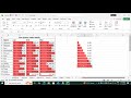
Pivot Table in Excel is one of the most powerful tools used for data analysis and reporting. It allows you to quickly summarize, analyze, and compare large datasets with just a few clicks. In this tutorial, you’ll learn how to create Pivot Tables from raw data and transform them into meaningful reports.
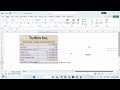
You’ll also discover how to design interactive dashboards using Slicers and Timelines to filter data dynamically and make your reports more user-friendly. The video will cover advanced Pivot Table features like Calculated Fields, Grouping, Show Values As (Percentage, Rank, Difference), and Pivot Charts for visual analysis.
By the end of this session, you’ll be able to create professional and dynamic dashboards in Excel using Pivot Tables that impress in reports, MIS presentations, and business meetings.
Видео Mastering Pivot Tables in Excel: Create Interactive Dashboards with Slicers, Timelines | канала IT TECH
Комментарии отсутствуют
Информация о видео
18 октября 2025 г. 13:05:10
00:45:45
Другие видео канала


![Understanding Keys, Constraints, and SQL Clauses [ ORDER BY, GROUP BY, HAVING, LIMIT ] Session#6](https://i.ytimg.com/vi/XQAvlX5BdCs/default.jpg)


![[#6] "MySQL Data Types Explained Simply" | MySQL Tutorial | #ITTECH](https://i.ytimg.com/vi/0_kvInMA6AQ/default.jpg)