- Популярные видео
- Авто
- Видео-блоги
- ДТП, аварии
- Для маленьких
- Еда, напитки
- Животные
- Закон и право
- Знаменитости
- Игры
- Искусство
- Комедии
- Красота, мода
- Кулинария, рецепты
- Люди
- Мото
- Музыка
- Мультфильмы
- Наука, технологии
- Новости
- Образование
- Политика
- Праздники
- Приколы
- Природа
- Происшествия
- Путешествия
- Развлечения
- Ржач
- Семья
- Сериалы
- Спорт
- Стиль жизни
- ТВ передачи
- Танцы
- Технологии
- Товары
- Ужасы
- Фильмы
- Шоу-бизнес
- Юмор
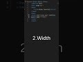
CSS Media Queries Explained | Make Any Website Responsive (Mobile to Desktop)
In this video, you’ll learn how to use Width, Height, and Orientation in CSS Media Queries to make websites fully responsive.
Media Queries are the backbone of responsive web design, and understanding how screen width, height, and device orientation (portrait & landscape) works is very important for real-world projects.
📌 Topics Covered:
✅ What is Media Query
✅ Screen Width in Media Query (max-width, min-width)
✅ Screen Height in Media Query (max-height, min-height)
✅ Orientation Media Query (portrait vs landscape)
✅ Real Device Testing in Browser DevTools
✅ Practical Responsive Examples
After watching this video, you will be able to design layouts that work perfectly on mobile, tablet, and desktop devices.
#css
#display
#cssdisplay
#displayblock
#displayinline
#inlineblock
#webdevelopment
#htmlcss
#csstutorial
#frontenddevelopment
#cssforbeginners
#coding
#webdesign
#CSS
#CSSPosition
#CSSPositioning
#WebDevelopment
#FrontendDevelopment
#LearnCSS
#CSSTutorial
#CSSForBeginners
#StaticRelativeAbsolute
#FixedSticky
#ZIndex
#CSSOverflow
#Coding
#WebDesign
#Programming
#WebDevelopment
#WebDeveloper
#FrontendDevelopment
#HTML
#css
#HTMLCSS
#LearnWebDevelopment
#WebDev
#Coding
#Programming
#FrontendDeveloper
#WebDesign
#CodeNewbie
#DeveloperLife
#learntocode
#flexbox
#cssdisplay
#cssflexbox #css
#flexbox
#cssflexbox
#flexboxtutorial
#webdevelopment
#frontenddevelopment
#htmlcss
#coding
#codingtutorial
#webdesign
#learncss
#developer
#responsiveDesign
#programming
Видео CSS Media Queries Explained | Make Any Website Responsive (Mobile to Desktop) канала Elevate Your Prep
Media Query Responsive Design CSS Media Query CSS Responsive Website CSS Width Height Orientation Min Width CSS Max Width CSS Min Height CSS Max Height CSS Responsive Web Design CSS HTML CSS Responsive CSS Tutorial Beginners Web Development CSS Mobile Responsive Website Learn Media Queries CSS Responsive Layout html css css for beginner web development css html html css tutorial frontend development webdevelopment css css tutorial
Комментарии отсутствуют
Информация о видео
5 апреля 2026 г. 21:55:26
00:21:12
Другие видео канала
 CSS Borders: Styles, Sides, Radius, & Shorthand Explained! || Tutorial 7 || web development Series
 How to Create Links in HTML || Part 1 || || Complete HTML Tutorial for Beginners
 HTML Multimedia & Download | Audio, Video, YouTube Embed & File Download
 Implementing Typing Animation in React.js with react-typed - Step-by-Step Guide
 Google job update || web application Engineer || Fresher jobs
 CSS Position Explained 🔥 | Static vs Relative vs Absolute vs Fixed vs Sticky | z-index & Overflow
 Build a Responsive Header with Hamburger Menu in React.js & Tailwind CSS
 Software jobs for fresher , experienced || Remote jobs.
 TOP 5 Websites to Find Jobs
 HTML Structure Explained || Complete HTML Tutorial for Beginners
 How to add video in websites || HTML VIDEO TAG
 How to implement date, time, and file input elements in HTML
 Margin vs Padding in CSS | Complete Explanation with Examples
 Job Search Websites: Your Gateway to New Opportunities
 CSS Flexbox Complete Tutorial 🔥 | Flex Properties Explained
 HTML Lists Explained | Ordered, Unordered & Description List || Complete HTML Tutorial for Beginners
 Learn Important HTML Tags🔥|| Complete HTML Tutorial for Beginners
 TOP 10 Websites to Find Jobs
 Semantic vs Non-Semantic HTML | HTML Tutorial
 Simple LOGIN & SIGNUP || Tailwind CSS || Reactjs
 CSS Background-Size Contain vs. Cover Explained || web development Series || shorts #cssbackground