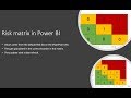
Case Study: Creating a Work Order Risk Matrix Visual in Power BI Using the Synoptic Panel
In this case study video, I show you how to create a visualisation that displays a risk matrix with the number of work orders in each risk zone. I use a custom visual called the Synoptic Pane that allows you to create an image, then define zones over the image that can be mapped to fields in Power BI.
The visual is fully interactive so you can click on an area and filter the work orders related to that risk zone. This is ideal for allowing you to quickly view how many high-risk defects you have in your plant and then view the list of work order details.
Resources:
To download the file or learn how to build the work order analysis dashboard in the video goto the site below and register for FREE
https://effectivedashboards.com/power-bi-quick-start-create-a-pbi-dashboard-in-90-minutes/
For more information on the visual I use in the video goto here:
https://okviz.com/synoptic-panel/
For the SVG and source files for the matrix visit:
https://effective-maintenance-dashboards-with-powerbi.teachable.com/p/power-bi-resources
Видео Case Study: Creating a Work Order Risk Matrix Visual in Power BI Using the Synoptic Panel канала Jason Davidson
Показать
Комментарии отсутствуют
Информация о видео
Другие видео канала
 Creating a Risk matrix in Power BI for Project Online
 How to create risk map in Excel - Charting Tip
 Power BI Custom Visuals - Synoptic Panel
 Power BI Desktop Introduction #4 - DAX Formulas & Creating Measures
 Case Study - How I Designed a Maintenance KPI Dashboard Using Power BI
 QT#30 - Power BI - How to CLEAR all FILTERS on the screen with ONE CLICK
 Using DAX to format a list of values in Power BI Desktop
 Creating A KPI Scorecard Report: Part 1
 Power BI Academy: Synoptic Panel Slicer Using Custom Images
 CASE STUDY: Creating an MLM Offer
 Data modeling best practices - Part 1 - in Power BI and Analysis Services
 Risk and How to use a Risk Matrix
 Power BI Desktop for Beginners: Create your first Power BI report and dashboard in 10 minutes
 Power BI - How to Fix Your Scatter Chart
 Managing Your Supply Chain Data w/Power BI - Analysis Techniques
 Creating a Risk matrix in power BI part 2
 Using Bookmarks in PowerBI
 Working with images in Power BI
 Create a Heat Map in Power BI
 Developing multi-tenant SaaS application with Power BI Embedded Analytics: Best - BRK4014