- Популярные видео
- Авто
- Видео-блоги
- ДТП, аварии
- Для маленьких
- Еда, напитки
- Животные
- Закон и право
- Знаменитости
- Игры
- Искусство
- Комедии
- Красота, мода
- Кулинария, рецепты
- Люди
- Мото
- Музыка
- Мультфильмы
- Наука, технологии
- Новости
- Образование
- Политика
- Праздники
- Приколы
- Природа
- Происшествия
- Путешествия
- Развлечения
- Ржач
- Семья
- Сериалы
- Спорт
- Стиль жизни
- ТВ передачи
- Танцы
- Технологии
- Товары
- Ужасы
- Фильмы
- Шоу-бизнес
- Юмор
CSS Animation: Move & Rotate a Div Easily! 🚀 #shorts #coding #css #beginners #animation
Kya aap seekhna chahte hain ki HTML aur CSS ka use karke ek beautiful animated box (div) kaise banate hain? To yeh video aapke liye hai!
Is short video mein, maine step-by-step dikhaya hai ki kaise aap simple code likh kar ek static div ko ek awesome animation mein badal sakte hain. Video ke starting mein aapko animation ka preview dikhega, aur uske turant baad humne uska actual HTML aur CSS code share kiya hai jise aap apne project mein copy-paste kar sakte hain.
Glow-up your web development skills i n just a few seconds! 💻✨
What you will learn in this video:
1.How to structure a box using HTML div
2.Styling and centering the box with CSS
3.Adding smooth transitions and keyframe animations
#shorts #frontendcourse #coding #for biggeners #learncoding #css #animationī
💻👉Use css code from here :-
body{
background-color: black;
}
#di{
background:red;
border: solid ;
border-width: 2px;
border-color: transparent ;
height: 100px;
width: 100px;
position: fixed;
top: 100px;
animation-name: col1;
animation-duration: 6s;
animation-delay: 0s;
animation-iteration-count: 2;
animation-timing-function: ease-in;
color: white;
text-align:center;
font-size:18px;
}
@keyframes col1{
0% {transform: translateX(-150%) scale(1) rotate(0deg);
background-color: red;
color: white;
}
30% {transform: translateX(40vw) scale(1) rotate(0deg);
background-color: yellow;
color: blue;
}
45% {transform: translateX(40vw) scale(1.5) rotate(360deg);
background-color: yellow;
color: blue;
}
55% {transform: translateX(40vw) scale(1.5) rotate(360deg);
background-color: green ;
color: white;
}
65% {transform: translateX(40vw) scale(1.5) rotate(0deg);
background-color:green ;
color: white;
}
80% {transform: translateX(40vw) scale(1.5) rotate(0deg);
background-color: purple;
color: aqua;
}
100% {transform: translateX(150vw) scale(1) rotate(0deg);
background-color: purple;
color: aqua;
}
}
Видео CSS Animation: Move & Rotate a Div Easily! 🚀 #shorts #coding #css #beginners #animation канала FrontEnd Verse
Комментарии отсутствуют
Информация о видео
11 июня 2026 г. 18:17:54
00:00:30
Другие видео канала
 Can You make this animation ✨? | CSS Animation on mobile. #animation #css #frontend #shorts video
 Making time picker by HTML for beginner ⏰ 💻 🚀 | Web Development Hindi #html #short #coding #frontend
 How to merge cell on table like excel | html table design by Colspan and Rowspan #coding #shorts
 Create Google Login Form in HTML 📝 | Day 9 HTML Tutorial #shorts
 Day 2 of HTML series #coding #html #trending #frontend
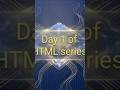 Day 1 of HTML series #html #coding #trending
 HTML Dropdown Menu in 30 second ✅| HTML Dropdown Menu Tutorial 💻 (Hindi)
 Making a button to upload file on website by html computer 💻 🗃️ #html #shorts #coding #file #pdf
 Removing underline from link🔗 which created by HTML using CSS. #html #coding #frontend #shorts #css
 Day 3 of HTML series #coding #html #trending #frontend #formatting
 how to add border on on table in html | Day 8 of HTML series part 2 #html #coding #shorts
 Ordered list in html Day 6 of HTML series #coding #html #frontend #shorts
 #html #trending #coding
 Bouncing Ball by CSS Animation ball ✨🏀. Using only mobile#coding #css #css3 #animation #beginner
 How to Create a Secure Password Input in HTML (Avoid This Mistake❌) #html #coding #frontend #shorts
 Making date picker by HTML for beginners 💻 🚀 | Web Development Hindi #html #shorts #coding #frontend
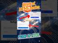
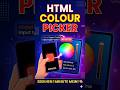 Making colour picker 🌈 by HTML for beginner 💻 | Web Development Hindi #html #short #coding #frontend
 No Laptop? No Problem! Text Animation on Mobile 💻❌🔥#coding #shorts #programming #html #beginner
 How to create bullet points in HTML Day 7 of HTML series #coding #programming #shorts
 How to make table html part 1 | tr td th | Day 8 of HTML series #shorts