Intro to Data Visualization with R & ggplot2
The R programming language is experiencing rapid increases in popularity and wide adoption across industries. This popularity is due, in part, to R’s rich and powerful data visualization capabilities. While tools like Excel, Power BI, and Tableau are often the go-to solutions for data visualizations, none of these tools can compete with R in terms of the sheer breadth of, and control over, crafted data visualizations.
As an example, R’s ggplot2 package provides the R programmer with dozens of print-quality visualizations – where any visualization can be heavily customized with a minimal amount of code.
In this webinar we will provide an introduction to data visualization with the ggplot2 package. The focus of the webinar will be using ggplot2 to analyze your data visually with a specific focus on discovering the underlying signals/patterns of your business.
Attendees will learn how to:
• Craft ggplot visualizations, including customization of rendered output.
• Choose optimal visualizations for the type of data and the nature of the analysis at hand.
• Leverage ggplot2’s powerful segmentation capabilities to achieve “visual drill-in of data”.
• Export ggplot2 visualizations from RStudio for use in documents and presentations.
Repository:
https://code.datasciencedojo.com/datasciencedojo/tutorials/tree/master/Introduction%20to%20Data%20Visualization%20with%20R%20and%20ggplot2
--
Watch more community talks:
https://tutorials.datasciencedojo.com/category/community-talks/
--
Learn more about Data Science Dojo here:
https://datasciencedojo.com/data-science-bootcamp/
Watch the latest video tutorials here:
https://tutorials.datasciencedojo.com/
See what our past attendees are saying here:
https://datasciencedojo.com/reviews/
--
Like Us: https://www.facebook.com/datasciencedojo/
Follow Us: https://twitter.com/DataScienceDojo
Connect with Us: https://www.linkedin.com/company/data-science-dojo
Also find us on:
Instagram: https://www.instagram.com/data_science_dojo/
#rtutorial #datavisualization #rprogramming
Видео Intro to Data Visualization with R & ggplot2 канала Data Science Dojo
Показать
Комментарии отсутствуют
Информация о видео
Другие видео канала
 R Programming Tutorial - Learn the Basics of Statistical Computing
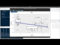 Introduction to ggplot in R
 ggplot2 workshop part 1
 Introduction to R Programming for Excel Users
 Interactive Dashboards in R | Data Visualization with Popular Plots, Data Tables & Pivot Charts
 Intro to Machine Learning with R & caret
 Learn R: An Introduction to ggplot2
 EMBL Keynote Lecture - Data visualization and data science, Hadley Wickham
 Plotly using R
 R data manipulation with RStudio and dplyr
 Cluster analysis
 R for Data Science - Full Course - Learn R for Data Science in 6 Hours
 Data Visualization in R ggplot2
 Reshape, Subset, and Summarize Data | Introduction to dplyr Part 2
 Make Beautiful Graphs in R: 5 Quick Ways to Improve ggplot2 Graphs
 Quick Plots - R Studio (ggplot2)
 R Studio: Importing & Analyzing Data
 Plotting with ggplot2: Part 1
 ggplot2 Tutorial | ggplot2 In R Tutorial | Data Visualization In R | R Training | Edureka