- Популярные видео
- Авто
- Видео-блоги
- ДТП, аварии
- Для маленьких
- Еда, напитки
- Животные
- Закон и право
- Знаменитости
- Игры
- Искусство
- Комедии
- Красота, мода
- Кулинария, рецепты
- Люди
- Мото
- Музыка
- Мультфильмы
- Наука, технологии
- Новости
- Образование
- Политика
- Праздники
- Приколы
- Природа
- Происшествия
- Путешествия
- Развлечения
- Ржач
- Семья
- Сериалы
- Спорт
- Стиль жизни
- ТВ передачи
- Танцы
- Технологии
- Товары
- Ужасы
- Фильмы
- Шоу-бизнес
- Юмор
animation after before code html css #coding #webdesign #html #python #webdevelopment #programming
div class="box" Animation /div
.box {
position: relative;
width: 400px;
height: 400px;
background: repeating-conic-gradient(from var(--a), #ff2770 0%, #ff2770 5%, transparent 5%, transparent 40%, #ff2770 50%);
animation: animate 4s linear infinite;
border-radius: 15px;
}
@property --a {
syntax: 'angle';
inherits: false;
initial-value: 0deg;
}
@keyframes animate {
0% {
--a: 0deg;
}
100% {
--a: 360deg;
}
}
.box::before {
content: '';
position: absolute;
width: 100%;
height: 100%;
background: repeating-conic-gradient(from var(--a), #45f3ff 0%, #45f3ff 5%, transparent 5%, transparent 40%, #45f3ff 50%);
animation: animate 4s linear infinite;
animation-delay: -1s;
border-radius: 15px;
}
.box::after {
content: '';
position: absolute;
inset: 8px;
background: #2d2d39;
border-radius: 15px;
border: 8px solid #25252b;
}
Видео animation after before code html css #coding #webdesign #html #python #webdevelopment #programming канала Code - Bard Project
Комментарии отсутствуют
Информация о видео
18 июля 2024 г. 15:03:55
00:00:29
Другие видео канала
 loss of feelings #codebardproject
 html css javascript Code - Bard Project | Coffee Situation
 birthday 🎉💐 wishes card project using HTML and CSS #html #css #birthdaycelebration #shorts
 Html css #doubletake #kpop #nct #bts #straykids
 Css Display :Flex
 beko html css sass javascript bootstrap #codebardproject
 card slider water drop html css javascript #codebardproject
 Google Loader HTML CSS #coding #shorts #webdesign #programming #javascript #animation #android
 Html css and night #doubletake #kpop #nct #bts #straykids #artist #조슈아 #세븐틴 #coding #html
 comfort #yunjinlee #kpop #cover #lesserafim #twice #lesserafimeunchae #lesserafimunforgiven
 WATERCOOLED PC IN 200$ BUGHT #coding #webdev #webdesign #webdevelopment #programming #javascript
 html5up hyperspace html css javascript #codebardproject
 Html css functional code
 Vscode editor
 3D design spline.design
 animation html css #coding #howtomakewebsiteusinghtmlandcss #webdesign #python #howtocreateawebsite
 HTML input
 Html css animatic
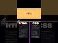
 How to become a senior fullstack developer #html #webdevelopment #javascript #devloper #shortvideo
 Flutter Profile Screen UI @clutchcoders #flutter #dart #video #YouTube #youtuber #iOS #tutorial